In this tutorial, you will find the detailed description of all the trendline options available in Excel and when to use them. You will also learn how to display a trendline equation in a chart and find the slope of trendline.
It is very easy to add a trendline in Excel. The only real challenge is to choose the trendline type that best corresponds to the type of data you are analyzing. In this tutorial, you will find the detailed description of all the trendline options available in Excel and when to use them. If you are looking for how to insert a trendline in an Excel chart, please check out the above linked tutorial.
Excel trendline types
When adding a trendline in Excel, you have 6 different options to choose from. Additionally, Microsoft Excel allows displaying a trendline equation and R-squared value in a chart:
- Trendline equation is a formula that finds a line that best fits the data points.
- R-squared value measures the trendline reliability - the nearer R2 is to 1, the better the trendline fits the data.
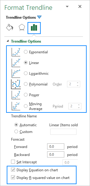
Below, you will find a brief description of each trendline type with chart examples.
Linear trendline
The linear trend line is best to be used with linear data sets when the data points in a chart resemble a straight line. Typically, a linear trendline describes a continuous rise or fall over time.
For example, the following linear trendline shows a steady increase in sales over 6 months. And the R2 value of 0.9855 indicates a pretty good fit of the estimated trendline values to the actual data.

Exponential trendline
The exponential trendline is a curved line that illustrates a rise or fall in data values at an increasing rate, therefore the line is usually more curved at one side. This trendline type is often used in sciences, for example to visualize a human population growth or decline in wildlife populations.
Please note that an exponential trendline cannot be created for data that contains zeros or negative values.
A good example of an exponential curve is the decay in the entire wild tiger population on the earth.

Logarithmic trendline
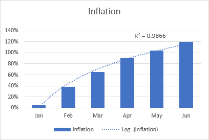
The logarithmic best-fit line is generally used to plot data that quickly increases or decreases and then levels off. It can include both positive and negative values.
An example of a logarithmic trendline may be an inflation rate, which first is getting higher but after a while stabilizes.
Polynomial trendline
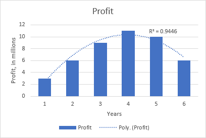
The polynomial curvilinear trendline works well for large data sets with oscillating values that have more than one rise and fall.
Generally, a polynomial is classified by the degree of the largest exponent. The degree of the polynomial trendline can also be determined by the number of bends on a graph. Typically, a quadratic polynomial trendline has one bend (hill or valley), a cubic polynomial has 1 or 2 bends, and a quartic polynomial has up to 3 bends.
When adding a polynomial trendline in an Excel chart, you specify the degree by typing the corresponding number in the Order box on the Format Trendline pane, which is 2 by default:

For example, the quadratic polynomial trend is evident on the following graph that shows the relationship between the profit and the number of years the product has been on the market: rise in the beginning, peak in the middle and fall near the end.
Power trendline
The power trend line is very similar to the exponential curve, only it has a more symmetrical arc. It is commonly used to plot measurements that increase at a certain rate.
A power trendline cannot be added to an Excel chart that contains zero or negative values.
As an example, let's draw a power trendline to visualize the chemical reaction rate. Note the R-squared value of 0.9918, which means that our trendline fits the data almost perfectly.

Moving average trendline
When the data points in your chart have a lot of ups and downs, a moving average trendline can smooth the extreme fluctuations in data values to show a pattern more clearly. For this, Excel calculates the moving average of the number of periods that you specify (2 by default) and puts those average values as points in the line. The higher the Period value, the smoother the line.
A good practical example is using the moving average trendline to reveal fluctuations in a stock price that otherwise would be difficult to observe.

For more information, please see: How to add a moving average trendline to an Excel chart.
Excel trendline equations and formulas
This section describes the equations that Excel uses for different trendline types. You do not have to build these formulas manually, simply tell Excel to display the trendline equation in a chart.
Also, we will discuss the formula to find the slope of a trendline and other coefficients. The formulas assume that you have 2 sets of variables: independent variable x and dependent variable y. In your worksheets, you can use these formulas to get the predicted y values for any given values of x.
For consistency, we will be using the same data set with slightly varying values for all the examples. However, please keep in mind that it's only for demonstration purposes. In your real worksheets, you should choose the trendline type corresponding to your data type.
Important note! The trendline formulas should only be used with XY scatter charts because only this chart plots both x and y axes as numeric values. For more information, please see Why Excel trendline equation may be wrong.
Linear trendline equation and formulas
The linear trendline equation uses the least squares methods to seek the slope and intercept coefficients such that:
Where:
- b is the slope of a trendline.
- a is the y-intercept, which is the expected mean value of y when all x variables are equal to 0. On a chart, it's the point where the trendline crosses the y axis.
For linear regression, Microsoft Excel provides special functions to get the slope and intercept coefficients.
Slope of trendline
b: =SLOPE(y,x)
Y-intercept
a: =INTERCEPT(y,x)
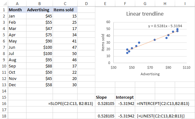
Assuming the x range is B2:B13 and the y range is C2:C13, the real-life formulas go as follows:
=SLOPE(C2:C13, B2:B13)
=INTERCEPT(C2:C13,B2:B13)
The same results can be achieved by using the LINEST function as an array formula. For this, select 2 adjacent cells in the same row, enter the formula and press Ctrl + Shift + Enter to complete it:
=LINEST(C2:C13,B2:B13)
As shown in the screenshot below, the slope and intercept coefficients returned by the formulas are perfectly in line with the coefficients in the linear trendline equation displayed in the chart, only the latter are rounded to 4 decimal places:
Exponential trendline equation and formulas
For the exponential trendline, Excel uses the following equation:
Where a and b are calculated coefficients and e is the mathematical constant e (the base of the natural logarithm).
The coefficients can be calculated by using these generic formulas:
a: =EXP(INDEX(LINEST(LN(y), x), 1, 2))
b: =INDEX(LINEST(LN(y), x), 1)
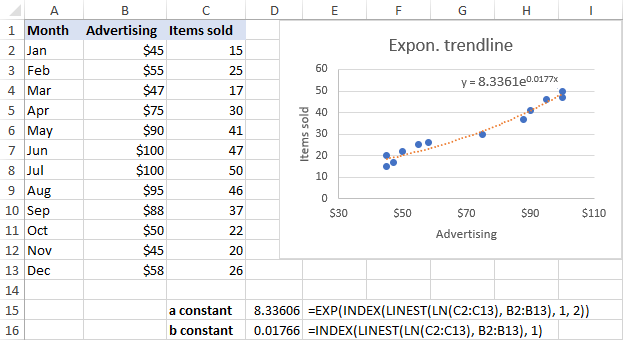
For our sample data set, the formulas take the following shape:
a: =EXP(INDEX(LINEST(LN(C2:C13), B2:B13), 1, 2))
b: =INDEX(LINEST(LN(C2:C13), B2:B13), 1)
Logarithmic trendline equation and formulas
Here's the logarithmic trendline equation in Excel:
Where a and b are constants and ln is the natural logarithm function.
To get the constants, use these generic formulas, which only differ in the last argument:
a: =INDEX(LINEST(y, LN(x)), 1)
b: =INDEX(LINEST(y, LN(x)), 1, 2)
For our sample data set, we use these ones:
a: =INDEX(LINEST(C2:C13, LN(B2:B13)), 1)
b: =INDEX(LINEST(C2:C13, LN(B2:B13)), 1, 2)

Polynomial trendline equation and formulas
To work out the polynomial trendline, Excel uses this equation:
Where b1…b6 and a are constants.
Depending on the degree of your polynomial trendline, use one of the following sets of formulas to get the constants.
Quadratic (2nd order) polynomial trendline
Equation: y = b2x2+ b1x + a
b2: =INDEX(LINEST(y, x^{1,2}), 1)
b1: =INDEX(LINEST(y, x^{1,2}), 1, 2)
a: =INDEX(LINEST(y, x^{1,2}), 1, 3)
Cubic (3rd order) polynomial trendline
Equation: y = b3x3 + b2x2+ b1x + a
b3: =INDEX(LINEST(y, x^{1,2,3}), 1)
b2: =INDEX(LINEST(y, x^{1,2,3}), 1, 2)
b1: =INDEX(LINEST(y, x^{1,2,3}), 1, 3)
a: =INDEX(LINEST(y, x^{1,2,3}), 1, 4)
The formulas for higher degree polynomial trendlines can be built by using the same pattern.
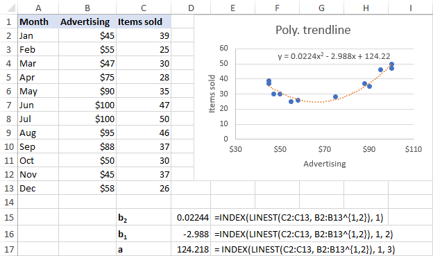
For our data set, the 2nd order polynomial trendline suites better, so we are using these formulas:
b2: =INDEX(LINEST(C2:C13, B2:B13^{1,2}), 1)
b1: =INDEX(LINEST(C2:C13, B2:B13^{1,2}), 1, 2)
a: =INDEX(LINEST(C2:C13, B2:B13^{1,2}), 1, 3)
Power trendline equation and formulas
A power trendline in Excel is drawn based on this simple equation:
Where a and b are constants, which can be calculated with these formulas:
a: =EXP(INDEX(LINEST(LN(y), LN(x),,), 1, 2))
b: =INDEX(LINEST(LN(y), LN(x),,), 1)
In our case, the following formulas work a treat:
a: =EXP(INDEX(LINEST(LN(C2:C13), LN(B2:B13),,), 1, 2))
b: =INDEX(LINEST(LN(C2:C13), LN(B2:B13),,), 1)

Excel trendline equation is wrong - reasons and fixes
If you think that Excel has drawn a trendline incorrectly or the trendline formula displayed in your chart is wrong, the following two points may shed some light on the situation.
Excel trendline equation is correct only in scatter charts
Excel trendline formulas should only be used with XY (scatter) graphs because only in this chart type both the y-axis and x-axis are plotted as numeric values.
In line charts, column and bar graphs, numeric values are plotted only on the y-axis. The x-axis is represented by a linear series (1, 2, 3,…) regardless of whether the axis labels are numbers or text. When you make a trendline in these charts, Excel uses those assumed x-values in the trendline formula.
Numbers are rounded in Excel trendline equation
To occupy less space in the chart, Excel displays very few significant digits in a trendline equation. Nice in terms of design, it significantly reduces the formula's accuracy when you manually supply x values in the equation.
An easy fix is to show more decimal places in the equation. Alternatively, you can calculate the coefficients by using a formula corresponding to your trendline type, and format the formula cells so that they show a sufficient number of decimal places. For this, simply click the Increase Decimal button on the Home tab in the Number group.
That's how you can make different trendline types in Excel and get their equations. I thank you for reading and hope to see you on our blog next week!
 by
by
75 comments
I have read many questions and replies regarding polynomials. However, I cannot reproduce the example (e.g. 2. order).
Differences i NLS support require ";" instead of "," - as previously remarked.
But =LINEST(C2:C13;B2:B13^{1;2}) fails because / when the list for "^" has fewer arguments (here 2) than the range B2:B13.
Suggestions ?
Hello Jan!
Your LINEST formula uses arrays of values of different sizes. C2:C13 is a one-dimensional array. B2:B13^{1;2} is a two-dimensional array. Therefore, the formula will not work.
Reply:
All formulas using "^" end up in a column.
Formula ={1;2;3}^{1;2;3;4} ={1;2;3;4}^{1;2;3} ={1;2;3}^{1;2;3}
Results 1 1 1
4 4 4
27 27 27
#N/A #N/A
Sorry, it's not quite clear what you are trying to achieve.
Ok, I am trying to follow the guidance for computing the coefficients b6 to b1 and a for a polynomial trend line.
Others, in 2022 express success, but I get #VALUE ond "N/A errors. To find the issue, I have decomposed the suggested approach.
This ends with the "power function2 (x^n), where x and n are arrays in the guidance.
Finally, when no solution, I used the base data from the example (12 values) to no avail.
I really appreciate your help. I am trying to reproduce the example just BEFORE the heading: "Power trendline equation and formulas".
My Excel is current 365 but using NLS (hence the use of ";" instead of "," for US English.
regards,
Hi! I have reproduced the example from the article that you are writing about. I got no errors in these three formulas.
Please note that formula that you wrote in the first comment is not correct and does not correspond to the formula in the article. It does not contain all arguments that are required.
In my formula TRANSPOSE((D2:D6)), using the new column, could also be written (e.g. typed) TRANSPOSE({1;2;3;4;5}) for a 4th order polynomium.
The "^" functin works differently (for me) than shown in the guidance paper above.
Thank you for your support on this issue.
I cannot determine the root cause om my issues, which seem to originate for mismatched array dimensions or inability to discount "cell errors".
The issue can also be with the "n^p" function, specifically the array p which should be a row.
By adding a single column D2:D7 to the data containing the values 1 to 6 corresponding to the polynomial exponents, the following formula works for me: =LINEST(C2:C13;B2:B13^TRANSPOSE(D2:D6)) which generates an array of 6 elements b5 to b1 and a for a polynomium (example 5th order).
The last cell reference D6 can be changed to get the appropriate coefficients; e.g. D7 for 6th order, or D4 for 3rd order.
Obviously, this could be automated with a cell containing the desired order - in the example 6 or 3.
End of issue.
Sorry, the layout in my resonse is corruptet; read as 4 columns, please.
thanks a lot, you resolved my problem in a few minutes... kudos
Thank you so much for this post! It's easy to understand and really solve my problem:)
The Formula to extract the constants of Polynominal trendline only work in Vertical data table.
It not work in my Horizontal data table.
How to keep it working in Horizontal data table?
Additionally use TRANSPOSE() in the formula before referencing the horizontal data row
What if we want to find the coefficients to the trendline equation with the y-intercept set equal to a particular value (e.g., y-int. = 0)?
Inside the LINEST() function the 3rd argument is "Const": TRUE = calc b normally, FALSE = b = 0
I don't know if there is a way to force the intercept to any value other than zero.
check goal seek
My trendline plots correctly but the trendline equation solution for y yields incorrect y values. The equation is a 6th-degree polynomial. The correct y values range from -20 to 80. The x values range from 1900 to 2050. The incorrect y values are all in the range of -2.38E+15, plus and minus. I increased the decimal value to 30, but that did not affect the outcome. Any suggestion on how to fix this problem?
Thanks!
it works fine to me!
but only if the known_x and known_y vectors are columns... if they are rows instead, it gives me #VALUE error... is this normal/is there any way to use the function working with row input series?
Thanks!
TRANSPOSE the horizontal arrays. =LINEST(TRANSPOSE(A2:D2),TRANSPOSE(A1:D1)^{1,2})
Masterful job. College professors take note. Teach in understandable ways so that students can take practical knowledge with them. You don.t need to prove how smart you are.
I suspect that many of the #VALUE! errors (mine included) are the result of missing values, but I don't have time to investigate further. The cubic trendline function seems to not be troubled by missing values, but the coefficient extraction functions (INDEX and LINEST) generate #VALUE! errors on the same data series. Does anyone know how they treat missing values?
From a series of absolute numbers, which happen to be future quarterly estimates, I would like to calculate a growth rate. Is that possible and if so what would be the Excel formula code? merci
The numbers are: 2.91, 3.10, 3.28, 3.28, 3.52, 3.48, 3.38, 3.64, 4.12, 4.16, 3.72, 3.90, 3.68.
And if any of the numbers had negative values would that negate the exercise or is there a work around?
Hello!
Here is the article that may be helpful to you: Calculating percent change
Also pay attention to the article: How to calculate percent variance for negative numbers
I hope I answered your question. If you have any other questions, please don’t hesitate to ask.
This is very helpful information. I am confused though on how to calculate a value from the Power Law trendline in Excel. For instance, the trendline that I am looking at has values from 100 - 700 on the x-axis, 10,000 - 50,000 on the y-axis, and a curve that is asymptotic to both axes, decreasing from right to left. The provided trendline equation is y = 3E + 08x^(-1.611). What in the world does this mean?! Plugging any value of x into the equation produces a value of y = 3E + 0!
Your help is much appreciated!
In case you still need an answer, y = 3E + 08x^(-1.611) means y = (3*10^8) * x^(-1.611).
Hi, thanks for this very useful guide. I have calculated the a,b,c coefficients for my binomial equation (y = ax2+bx+c). From here, how do I compare this model with my actual data and calculate the R2 ?
problem solved - used log (x) as new column and then do straight polynomial fitting on that!
Help... I am trying to extract all the coefficients of this formula: y=10^(ax^4+bx^3+cx^2+dx+e)
but not working (esp the array part of the input), could someone shed some light please?
thank you!
Have you tried taking the log (base 10) of the equation, then using the polynomial trendline formulas, described above?
Thank-you this was exactly what I needed
glad to see people finding it useful, wish I could apply it too. I have a column of sales we've made thus far and have it plotted on a chart, where I also use plynomial trendline. how can I using the formulas above get the value of trendline at the end of period?
thanks, appriciate support
WHAT IS THE DIFFERENCE BETWEEN POLYNOMIAL ORDER 3 AND 4
Order 3 is y=Ax^3 + Bx^2 + Cx^1 + D. Order 4 is Order 3 is y=Zx^4 + Ax^3 + Bx^2 + Cx^1 + D.
great, thanks I tried with poly of order 3 (ax3 + bx2 + cx1 + x0)
it works perfectly and avoids me to make a trendline and manually copy the results
a possible improvement would be to allow the use of =na() for some empty cells (because I have differenet lines and x not always the same -results of measurements-) this is possible with graph
Hello!
Thanks for the information they were extremely helpful although I have some issues:
1) In my excel I cannot use comma (,) but only (;) for codes, otherwise excel will not understand it is a code and not just writing,
2) When I change it from "," to ";" and run the equations for the a, b1, and b2 for the polyonomial trendline, if I have negative values I take the message #VALUE, while when I only have positive values I get a normal result.
How should I address those issues?
Thank you again for the help!
I am looking for advice (please have a look on formulas):
=LINEST({2;6;10},{1;2;3})
work fine and calculate a,b for y=ax+b
=TREND({2;6;10},{1;2;3},4)
work fine and calculate next y
=LINEST({2;6;14},{1;2;3}^{1,2})
work fine and calculate a,b,c for y=ax^2+bx+c
=TREND({2;6;14},{1;2;3}^{1,2},4)
does not work! do you know why?
is there another TREND_FOR_POLYNOMINAL_OF_SECOND_ORDER function?
Try following formula:
=TREND({2;6;14},{1;2;3}^{1,2},4^{1;2})