The tutorial explains the Excel charts basics and provides the detailed guidance on how to make a graph in Excel. You will also learn how to combine two chart types, save a graph as chart template, change the default chart type, resize and move the graph.
Everyone needs to create graphs in Excel to visualize data or check on the latest trends. Microsoft Excel provides a wealth of powerful chart features, but it may be challenging to locate the necessary options. Unless you have a good understanding of various chart types and data types they are appropriate for, you may spend hours fiddling with different chart elements and yet end up creating a graph that bears only remote resemblance to what you've pictured in your mind.
This chart tutorial starts with the basics and walks you through the process of making a chart in Excel step-by-step. And even if you are a beginner with little to no experience, you will be able to create your first Excel graph in minutes and make it look exactly the way you want it to look.
Excel charts basics
A chart, also known as graph, is a graphical representation of numeric data where the data is represented by symbols such as bars, columns, lines, slices, and so on. It is common to make graphs in Excel to better understand large amounts of data or relationship between different data subsets.
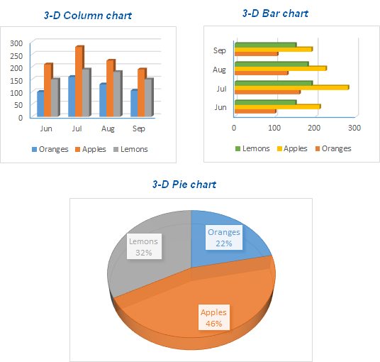
Microsoft Excel lets you create a great lot of different graph types such as Column chart, Bar chart, Line chart, Pie chart, Area chart, Bubble chart, Stock, Surface, Radar charts, and PivotChart.
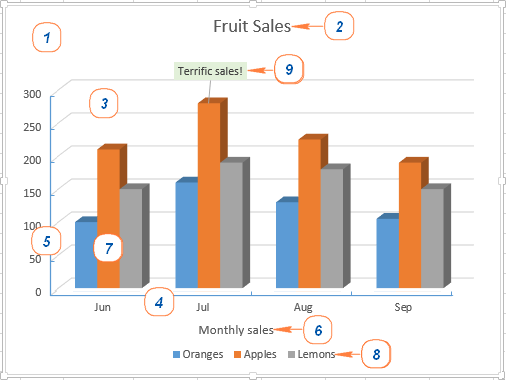
Excel charts have a handful of elements. Some of these elements are displayed by default, others can be added and modified manually as needed.
|
1. Chart area 2. Chart title 3. Plot area 4. Horizontal (category) axis 5. Vertical (value) axis |
6. Axis title 7. Data points of the data series 8. Chart legend 9. Data label |
How to make a graph in Excel
When creating graphs in Excel, you can select from a variety of chart types to present your data in the way most meaningful to your users. You can also make a combination graph by using several chart types.
To create a chart in Excel, you start by entering the numeric data on a worksheet, and then continue with the following steps.
1. Prepare the data to plot in a chart
For most Excel charts, such as bar charts or column charts, no special data arrangement is required. You can organize the data in rows or columns, and Microsoft Excel will automatically determine the best way to plot the data in your graph (you will be able to change this later).
To make a good-looking Excel chart, the following points could be helpful:
- Either the column headings or data in the first column are used in the chart legend. Excel automatically chooses the data for the legend based on your data layout.
- The data in the first column (or columns headings) is used as labels along the X axis of your chart.
- The numerical data in other columns are used to create the labels for the Y axis.
In this example, we are going to make a graph based on the following table.

2. Select data to include in the chart
Select all the data you want to include in your Excel graph. Be sure to select the column headings if you want them to appear either in the chart legend or axis labels.
- If you want to make a chart based on adjacent cells, you can select only one cell, and Excel will automatically include all contiguous cells that contain data.
- To create a graph based on the data in non-adjacent cells, select the first cell or a range of cells, hold down the CTRL key and select other cells or ranges. Please note, you can plot non-adjacent cells or ranges in a chart only if the selection forms a rectangle.
Tip. To select all used cells on the worksheet, place the cursor in the first cell of the used range (press Ctrl+Home to get to A1), and then press Ctrl + Shift + End to extend the selection to the last used cell (the lower-right corner of the range).
3. Inset the chart in Excel worksheet
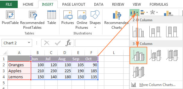
To add the graph on the current sheet, go to the Insert tab > Charts group, and click on a chart type you would like to create.
In Excel 2013 and higher, you can click the Recommended Charts button to view a gallery of pre-configured graphs that best match the selected data.

In this example, we are creating a 3-D Column chart. To do this, click the arrow next to the Column Chart icon and choose one of the chart sub-types under the 3-D Column category.
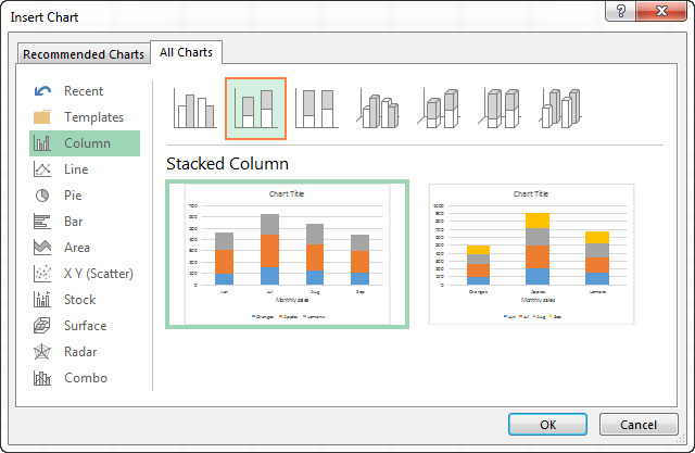
For more chart types, click the More Column Charts… link at the bottom. The Insert Chart dialog window will open, and you will see a list of available column chart sub-types at the top. You can also choose other graph types on the left hand side of the dialog.
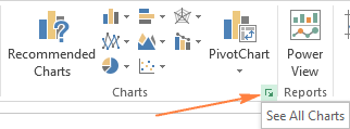
Tip. To immediately see all available chart types, click the Dialog Box Launcher next to Charts.
Well, basically, you are done. The graph is placed on your current worksheet as an embedded chart. Here's the 3-D Column chart created by Excel for our data:
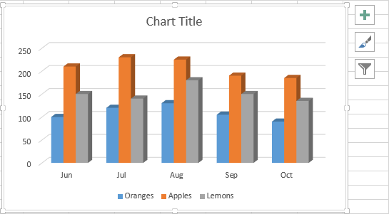
The chart already looks nice, and still you may want to make a few customizations and improvements, as explained in Customizing Excel charts section.
Tips:
- To promptly create an appropriate graph for the selected data, you can make use of the Quick Analysis Charts features.
- And here are some useful tips to make your graphs more functional and better looking: Excel Charts: tips, tricks and techniques.
Create a combo graph in Excel to combine two chart types
If you want to compare different data types in your Excel graph, creating a combo chart is the right way to go. For example, you can combine a column or area chart with a line chart to present dissimilar data, for instance an overall revenue and the number of items sold.
In Microsoft Excel 2010 and earlier versions, creating a combination chart was a cumbersome task, the detailed steps are explained by the Microsoft team in the following article: Combining chart types, adding a second axis. In Excel 2013 - Excel 365, those long-winded guidelines turn into four quick steps.
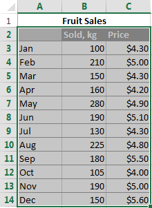
- Select the data you want to plot in your chart. In this example, we select the following Fruit Sales table that lists the amounts sold and average prices.
- On the Insert tab, click the Dialog Box Launcher
 next to Charts to open the Insert Chart dialog.
 - In the Insert Chart dialog, go to the All Charts tab and select the Combo category.
At the top of the dialog, you will see a few pre-defined combo charts to get you started quickly. You can click on each of them to see the chart preview, and there's a good chance that you will find the chart to your liking. Yep, the second graph - Clustered Column and Line on Secondary Axis - will do nicely for our data.
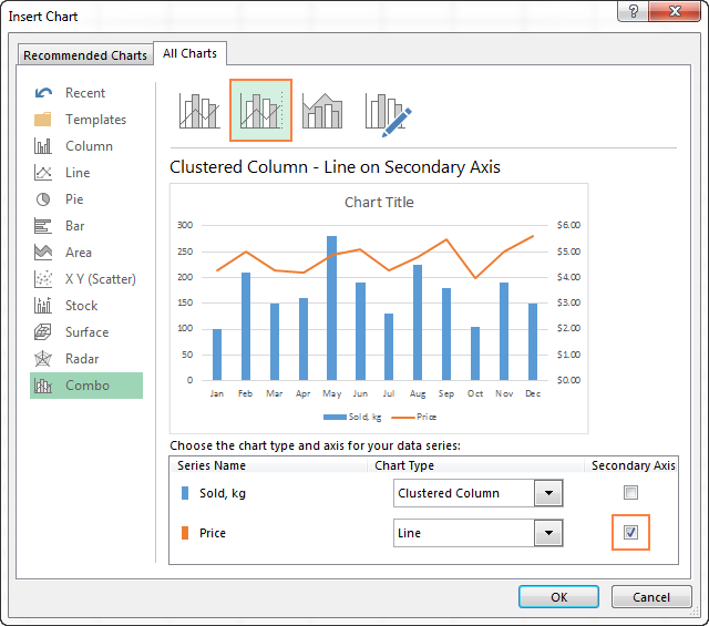
Given that our data series (Amount and Price) have different scales, we do need a secondary axis in one of them to clearly see the values for both series in the graph. If none of the predefined combo charts Excel displays to you has a secondary axis, then simply select the one you like the most, and check the Secondary Axis box for one of the data series.
If you are not quite happy with any of the pre-canned combo graphs, then select the Custom Combination type (the last one with the pen icon), and choose the desired chart type for each data series.
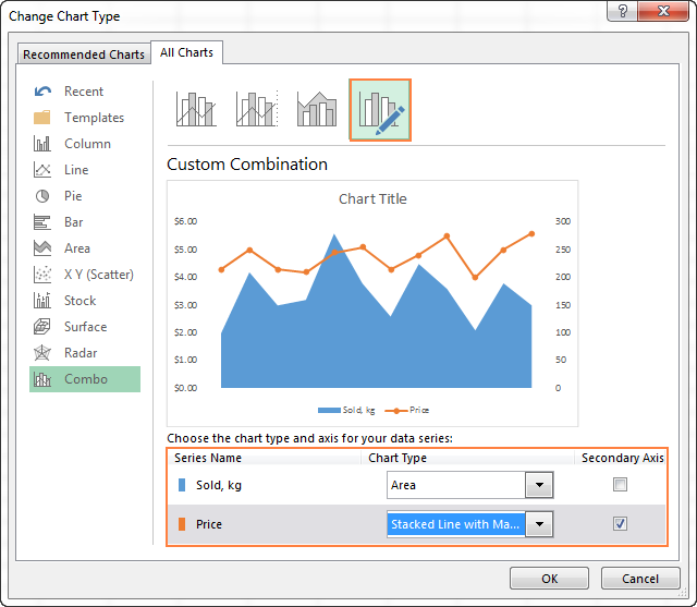
- Click the OK button to get the combo chart inserted in your Excel sheet. Done!
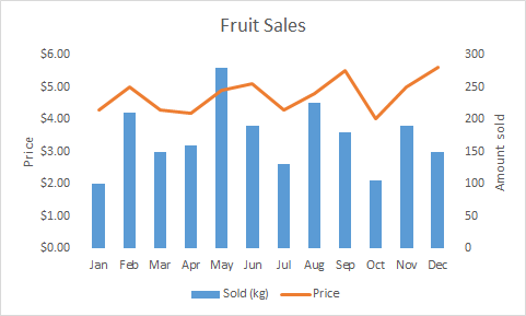
Finally, you may want to add some finishing touches, such as typing your chart title and adding axis titles. The completed combination chart may look similar to this:
Customizing Excel charts
As you have just seen, making a chart in Excel is easy. But after you've added a chart, you may want to modify some of the default elements to create an exquisite eye-catching graph.
The most recent versions of Microsoft Excel introduced many improvements in chart features and added a new way to access the chart formatting options.
Overall, there are 3 ways to customize charts in Excel 365 - 2013.
- Select the chart and look for the needed options on the Chart Tools tabs on the Excel ribbon.

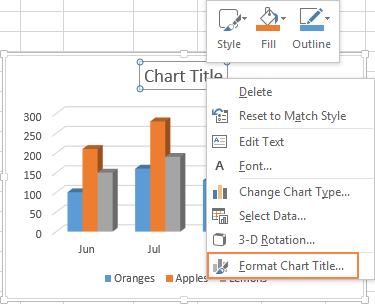
- Right-click an element on the chart and select the corresponding context menu item. For example, here's the right-click menu for customizing the chart title:
- Use on-object chart customization buttons. These buttons appear in the top right corner of your chart as soon as you click on it.
 Chart Elements button. It launches the checklist of all the elements you can modify or add to your graph, and it only shows those elements that are applicable to the selected chart type. The Chart Elements button supports Live Preview, so if you are not sure what a certain element is, hover the mouse on it and you will see what your graph would look like if you select that option.
 Chart Styles button. It lets you quickly change the chart styles and colors.
 Chart Filters button. It allows you to show or hide data displayed in your chart.
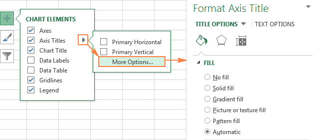
For more options, click the Chart Elements button, find the element you want to add or customize in the checklist, and click the arrow next to it. The Format Chart pane will appear on the right of your worksheet, where you can select the options you want:
Hopefully, this quick overview of the chart customization features has helped you to get the general idea of how you can modify graphs in Excel. In the next tutorial, we will have an in-depth look at how to customize different chart elements, such as:
Saving your favorite graph as Excel chart template
If you are really happy with the chart you've just created, you can save it as a chart template (.crtx file) and then apply that template to other graphs you make in Excel.
How to create a chart template
To save a graph as a chart template, right-click the chart and pick Save as Template in the pop-up menu:
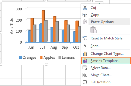
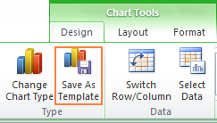
In Excel 2010 and older versions, the Save As Template feature resides on the ribbon, on the Design tab > Type group.
Clicking the Save As Template option brings up the Save Chart Template dialog, where you type the template name and click the Save button.
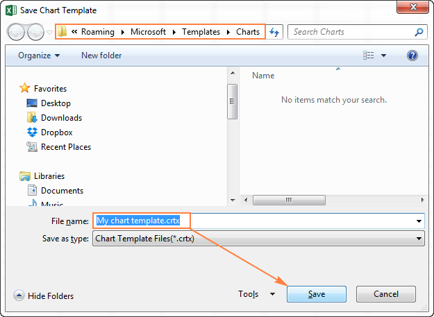
By default, the newly created chart template is saved to the special Charts folder. All chart templates stored to this folder are automatically added to the Templates folder that appears in the Insert Chart and Change Chart Type dialogs when you create a new or modify an existing graph in Excel.
Please keep in mind that only the templates that were saved to the Charts folder appear in the Templates folder in Excel. So, make sure you don't change the default destination folder when saving a template.
Tips:
- You can also save the entire workbook containing your favorite graph as a custom Excel template.
- If you downloaded some chart templates from the Internet and want them to appear in your Excel when you are making a graph, save the downloaded template as a .crtx file to the Charts folder:
C:\Users\User_name\AppData\Roaming\Microsoft\Templates\Charts
How to apply the chart template
To create a chart in Excel based on a specific chart template, open the Insert Chart dialog by clicking the Dialog Box Launcher in the Charts group on the ribbon. On the All Charts tab, switch to the Templates folder, and click on the template you want to apply.
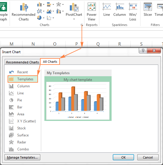
To apply the chart template to an existing graph, right click on the graph and choose Change Chart Type from the context menu. Or, go to the Design tab and click Change Chart Type in the Type group.
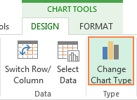
Either way, the Change Chart Type dialog will open, you find the desired template in the Templates folder and click on it.
How to delete a chart template in Excel
To delete a graph template, open the Insert Chart dialog, go to the Templates folder and click the Manage Templates button in the bottom left corner.
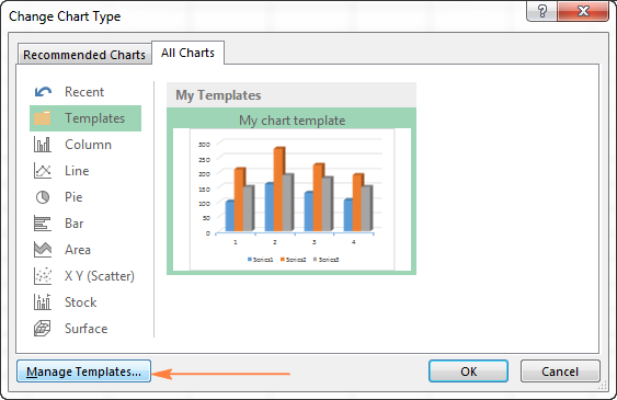
Clicking the Manage Templates button will open the Charts folder with all existing templates. Right click on the template you want to remove and choose Delete in the context menu.
Using the default chart in Excel
Excel's default chart is a real time-saver. Whenever you need a graph in a hurry or just want to have a quick look on certain trends in your data, you can make a chart in Excel with a single keystroke! Simply select the data to be included in the graph and press one of the following shortcuts:
- Alt + F1 to insert the default chart in the current worksheet.
- F11 to create the default chart in a new sheet.
How to change the default chart type in Excel
When you make a graph in Excel, the default chart format is a two-dimensional column chart.
To change the default graph format, perform the following steps:
- Click the Dialog Box Launcher
 next to Charts.
 - In the Insert Chart dialog, right click the chart (or the chart template in the Templates folder) and select the Set as Default Chart option in the context menu.
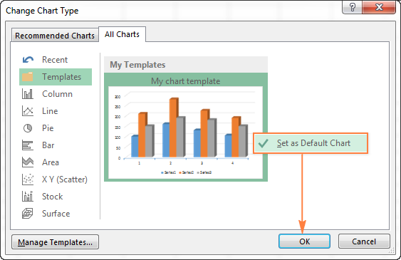
- Click OK to save the changes and close the dialog.
Resizing the chart in Excel
To resize the Excel graph, click on it, and then drag the sizing handles to the size you want.
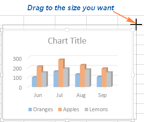
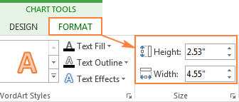
Alternatively, you can enter the desired chart height and width in the Shape Height and Shape Width boxes on the Format tab, in the Size group:
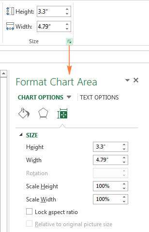
For more options, click the Dialog Box Launcher next to Size and configure the needed parameters on the pane.
Moving the chart in Excel
When you create a graph in Excel, it is automatically embedded on the same worksheet as the source data. You can move the chart to any location on the sheet by dragging it with the mouse.
If you find it easier to work with a graph on a separate sheet, you can move it there in the following way.
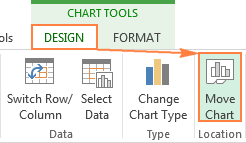
- Select the chart, go to the Design tab on the ribbon and click the Move Chart button.
- In the Move Chart dialog box, click the New Sheet. If you plan to insert multiple chart sheets in the workbook, give some descriptive name to the new sheet and click OK.
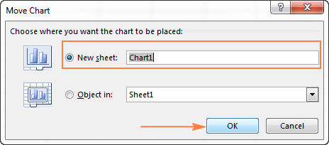
If you want to move the chart to an existing sheet, check the Object In option, and then select the needed worksheet in the drop-down list.
To export the chart somewhere outside of Excel, right-click on the chart border and click Copy. Then open another program or application and paste the graph there. You can find a few other chart saving techniques in the following tutorial: How to save Excel chart as image.
This is how you make charts in Excel. Hopefully, this overview of the basic chart features has helped you get off on the right foot. In the next tutorial, we will provide the detailed guidance on customizing different chart elements such as chart title, axes, data labels and so on. In the meantime, you may want to review other chart tutorials that we have (the links are at the end of this article). I thank you for reading and look forward to seeing you on our blog next week!
 by
by
15 comments
It's good and easy to use
How can I get this notes
its goog for analysis data
How to make a multiple price graph
Heights down
and widths across top
Filling in different prices
1) My question is related to Pivot Chart and Chart Template.
2) The purpose is to save Text Box(s), that contain information (not a field in Pivot Table), in Chart Template.
3) I observe that Chart elements like Chart Title & Axis Titles and Text Boxes are not saved to template; only Chart Area and Plot Area get saved.
4) I tried to include Text Box in Chart Area by unchecking, "Locked" & "Lock Text" in Format Shape > of Text Box Properties.
5) How to save them?
6) I use Office 365 on Windows 10 laptop.
Thanks for sparing your time.
Hi, When I save the chart as a Template and reuse the template, I cant seem to get the custom data labels from the original chart. Is there a special way to do this. Thanks.
I am trying to create simple line graphs using columns of data that are not adjacent. I want to be able to add new data to the table columns and have the graphs automatically update. I can build the graphs just fine but do not know how to get them to do the automatic updating. Thank you for any assistance you can provide.
Why do my charts keeps reverting back to 12.7cm width?
Dear Sir
I want to create Gantt Chart in Excel
Regards
anand
very good
I have some charts in a file from another person that I want to duplicate, so I have clicked on the chart I want to duplicate and saved it as a template, but when I try to use that template with the same layout of number just different values it doesn't come out exactly the same. For instance the new one doesn't show the floating target line above the bar and the axis needs to be switched. Is that normal? Am I doing something wrong? Are there certain features that the template won't save?
Hi,
I have an issue.
I have two line graphs in a single chart in excel 2013. I Want one line graph in any colour and the second one to have no outline .when i save the document the line graph with no outline does not save the change(s) and keeps re appearing yet i dont want it to be visible.
However i need the one with no outline because i need a trendline for the graph.Please assist.
Hi Matt,
It's difficult to provide you with a solution without seeing your data, but it sounds like you need to use VBA. It offers a lot more flexibility for working with tables and adding rows of data.
Hi,
I am trying to build software in excel that can help keep my renovation companies accounts etc in order. I have student version of office 2007 that I bought brand new unopened recently at a garage sale for 5$.
I have some experience in excel from back in college. I can and have built invoice sheet no problem. I have also built a sheet that handles my business expenses/tax return database etc. I have also built a customer profile page.
What I would like to do between the worksheets is have a customer profile page with name, address, city, postal code, phone number etc. I want a 2nd sheet that does the invoicing. The 3rd sheet is my expenses / tax sheet. I have the customer profile sheet feeding info into the invoice no problem automatically. What I cant do is get what ever invoice I am making, to have its total cost of the job, go down into my business expense/tax return database under income where it can be added into my gross income on the tax sheet.
Basically if I have invoice 50, all its info needs to feed directly into my expense/tax sheet showing the job cost/income, and the customer's name. Then when I do invoice 51, all its info needs to feed directly into my expense/tax sheet right under the last one and so on and so forth with each corresponding customer's name beside the job cost.
There may be free templates that do the above but hoping I can learn to build it myself please.
thanks.
matt
Hi im trying to take dates and names from multiple tab and have them feed to a stack column chart what type of formula would I use because I have tried so many and none will give me the results im looking for can someone help me please and thank you.
Hi Spencer,
You can use the Select Data Source window (Design tab > Select Data) to add data series from other sheets to your existing chart. It's difficult to give any specific recommendations without seeing the original data. But I'm going to write a new article next weeks with the detailed guidelines on how to create an Excel chart from 2 or more worksheets. So, please keep watching this space!