The tutorial explains the basics of correlation in Excel, shows how to calculate a correlation coefficient, build a correlation matrix and interpret the results.
One of the simplest statistical calculations that you can do in Excel is correlation. Though simple, it is very useful in understanding the relations between two or more variables. Microsoft Excel provides all the necessary tools to run correlation analysis, you just need to know how to use them.
Correlation in Excel - the basics
Correlation is a measure that describes the strength and direction of a relationship between two variables. It is commonly used in statistics, economics and social sciences for budgets, business plans and the like.
The method used to study how closely the variables are related is called correlation analysis.
Here are a couple of examples of strong correlation:
- The number of calories you eat and your weight (positive correlation)
- The temperature outside and your heating bills (negative correlation)
And here the examples of data that have weak or no correlation:
- Your cat's name and their favorite food
- The color of your eyes and your height
An essential thing to understand about correlation is that it only shows how closely related two variables are. Correlation, however, does not imply causation. The fact that changes in one variable are associated with changes in the other variable does not mean that one variable actually causes the other to change.
If you're interested to learn causality and make predictions, take a step forward and perform linear regression analysis.
Correlation coefficient in Excel - interpretation of correlation
The numerical measure of the degree of association between two continuous variables is called the correlation coefficient (r).
The coefficient value is always between -1 and 1 and it measures both the strength and direction of the linear relationship between the variables.
Strength
The larger the absolute value of the coefficient, the stronger the relationship:
- The extreme values of -1 and 1 indicate a perfect linear relationship when all the data points fall on a line. In practice, a perfect correlation, either positive or negative, is rarely observed.
- A coefficient of 0 indicates no linear relationship between the variables. This is what you are likely to get with two sets of random numbers.
- Values between 0 and +1/-1 represent a scale of weak, moderate and strong relationships. As r gets closer to either -1 or 1, the strength of the relationship increases.
Direction
The coefficient sign (plus or minus) indicates the direction of the relationship.
- Positive coefficients represent direct correlation and produce an upward slope on a graph - as one variable increases so does the other, and vice versa.
- Negative coefficients represent inverse correlation and produce a downward slope on a graph - as one variable increases, the other variable tends to decrease.
For better understanding, please take a look at the following correlation graphs:
- A coefficient of 1 means a perfect positive relationship - as one variable increases, the other increases proportionally.
- A coefficient of -1 means a perfect negative relationship - as one variable increases, the other decreases proportionally.
- A coefficient of 0 means no relationship between two variables - the data points are scattered all over the graph.

Pearson correlation
In statistics, they measure several types of correlation depending on type of the data you are working with. In this tutorial, we will focus on the most common one.
Pearson Correlation, the full name is the Pearson Product Moment Correlation (PPMC), is used to evaluate linear relationships between data when a change in one variable is associated with a proportional change in the other variable. In simple terms, the Pearson Correlation answers the question: Can the data be represented on a line?
In statistics, it is the most popular correlation type, and if you are dealing with a "correlation coefficient" without further qualification, it's most likely to be the Pearson.
Here's the most commonly used formula to find the Pearson correlation coefficient, also called Pearson's R:

At times, you may come across two other formulas for calculating the sample correlation coefficient (r) and the population correlation coefficient (ρ).
How to do Pearson correlation in Excel
Calculating the Pearson correlation coefficient by hand involves quite a lot of math. Luckily, Microsoft Excel has made things very simple. Depending on your data set and your goal, you are free to use one of the following techniques:
- Find the Pearson correlation coefficient with the CORREL function.
- Make a correlation matrix by performing Data Analysis.
- Find multiple correlation coefficients with a formula.
- Plot a correlation graph to get the visual representation of the data relationship.
How to calculate correlation coefficient in Excel
To compute a correlation coefficient by hand, you'd have to use this lengthy formula. To find correlation coefficient in Excel, leverage the CORREL or PEARSON function and get the result in a fraction of a second.
Excel CORREL function
The CORREL function returns the Pearson correlation coefficient for two sets of values. Its syntax is very easy and straightforward:
Where:
- Array1 is the first range of values.
- Array2 is the second range of values.
The two arrays should have equal length.
Assuming we have a set of independent variables (x) in B2:B13 and dependent variables (y) in C2:C13, our correlation coefficient formula goes as follows:
=CORREL(B2:B13, C2:C13)
Or, we could swap the ranges and still get the same result:
=CORREL(C2:C13, B2:B13)
Either way, the formula shows a strong negative correlation (about -0.97) between the average monthly temperature and the number of heaters sold:
To calculate the correlation coefficient in Excel successfully, please keep in mind these 3 simple facts: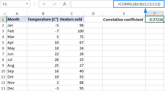
3 things you should know about the CORREL function in Excel
Excel PEARSON function
The PEARSON function in Excel does the same thing - calculates the Pearson Product Moment Correlation coefficient.
Where:
- Array1 is a range of independent values.
- Array2 is a range of dependent values.
Because PEARSON and CORREL both compute the Pearson linear correlation coefficient, their results should agree, and they generally do in recent versions of Excel 2007 through Excel 2019.
In Excel 2003 and earlier versions, however, the PEARSON function may display some rounding errors. Therefore, in older versions, it is recommended to use CORREL in preference to PEARSON.
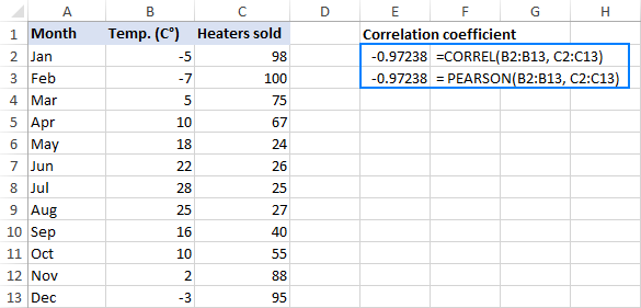
On our sample data set, both functions exhibit the same results:
=CORREL(B2:B13, C2:C13)
=PEARSON(B2:B13, C2:C13)
How to make a correlation matrix in Excel with Data Analysis
When you need to test interrelations between more than two variables, it makes sense to construct a correlation matrix, which is sometimes called multiple correlation coefficient.
The correlation matrix is a table that shows the correlation coefficients between the variables at the intersection of the corresponding rows and columns.
The correlation matrix in Excel is built using the Correlation tool from the Analysis ToolPak add-in. This add-in is available in all versions of Excel 2003 through Excel 2019, but is not enabled by default. If you have not activated it yet, please do this now by following the steps described in How to enable Data Analysis ToolPak in Excel.
With the Data Analysis tools added to your Excel ribbon, you are prepared to run correlation analysis:
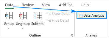
- On the top right corner of the Data tab > Analysis group, click the Data Analysis button.
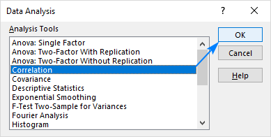
- In the Data Analysis dialog box, select Correlation and click OK.
- In the Correlation box, configure the parameters in this way:
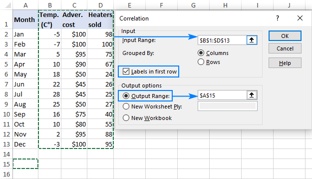
- Click in the Input Range box and select the range with your source data, including column headers (B1:D13 in our case).
- In the Grouped by section, make sure the Columns radio box is selected (given that your source data are grouped into columns).
- Select the Labels in first row check box if the selected range contains column headers.
- Choose the desired output option. To have the matrix in the same sheet, select Output Range and specify the reference to the leftmost cell into which the matrix is to be output (A15 in this example).
When done, click the OK button:
Your matrix of correlation coefficients is done and should look something like shown in the next section.
Interpreting correlation analysis results
In your Excel correlation matrix, you can find the coefficients at the intersection of rows and columns. If the column and row coordinates are the same, the value 1 is output.
In the above example, we are interested to know the correlation between the dependent variable (number of heaters sold) and two independent variables (average monthly temperature and advertising costs). So, we look only at the numbers at the intersection of these rows and columns, which are highlighted in the screenshot below:

The negative coefficient of -0.97 (rounded to 2 decimal places) shows a strong inverse correlation between the monthly temperature and heater sales - as the temperature grows higher, fewer heaters are sold.
The positive coefficient of 0.97 (rounded to 2 decimal places) indicates a strong direct connection between the advertising budget and sales - the more money you spend on advertising, the higher the sales.
How to do multiple correlation analysis in Excel with formulas
Building the correlation table with the Data Analysis tool is easy. However, that matrix is static, meaning you will need to run correlation analysis anew every time the source data change.
The good news is that you can easily build a similar correlation table yourself, and that matrix will update automatically with each change in the source values.
To have it done, use this generic formula:
Important note! For the formula to work, you should lock the first variable range by using absolute cell references.
In our case, the first variable range is $B$2:$B$13 (please notice the $ sign that locks the reference), and our correlation formula takes this shape:
=CORREL(OFFSET($B$2:$B$13, 0, ROWS($1:1)-1), OFFSET($B$2:$B$13, 0, COLUMNS($A:A)-1))
With the formula ready, let's construct a correlation matrix:
- In the first row and first column of the matrix, type the variables' labels in the same order as they appear in your source table (please see the screenshot below).
- Input the above formula in the leftmost cell (B16 in our case).
- Drag the formula down and to the right to copy it to as many rows and columns as needed (3 rows and 3 columns in our example).
As the result, we've got the following matrix with multiple correlation coefficients. Please notice that the coefficients returned by our formula are exactly the same as output by Excel in the previous example (the relevant ones are highlighted):
As you already know, the Excel CORREL function returns the correlation coefficient for two sets of variables that you specify. The main challenge is to supply the appropriate ranges in the corresponding cells of the matrix. For this, you enter only the first variable range in the formula and use the following functions to make the necessary adjustments: To better understand the logic, let's see how the formula calculates the coefficients highlighted in the screenshot above. First, let's examine the formula in B18, which finds correlation between the monthly temperature (B2:B13) and heaters sold (D2:D13): In the first OFFSET function, ROWS($1:1) has transformed to ROWS($1:3) because the second coordinate is relative, so it changes based on the relative position of the row where the formula is copied (2 rows down). Thus, ROWS() returns 3, from which we subtract 1, and get a range that is 2 columns to the right of the source range, i.e. $D$2:$D$13 (heater sales). The second OFFSET does not change the specified range $B$2:$B$13 (temperature) because COLUMNS($A:A)-1 returns zero. As the result, our long formula turns into a simple CORREL($D$2:$D$13, $B$2:$B$13) and returns exactly the coefficient we want. The formula in C18 that calculates a correlation coefficient for advertising cost (C2:C13) and sales (D2:D13) works in a similar manner: The first OFFSET function is absolutely the same as describe above, returning the range of $D$2:$D$13 (heater sales). In the second OFFSET, COLUMNS($A:A)-1 changes to COLUMNS($A:B)-1 because we've copied the formula 1 column to the right. Consequently, OFFSET gets a range that is 1 column to the right of the source range, i.e. $C$2:$C$13 (advertising cost).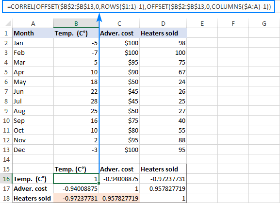
How this formula works
=CORREL(OFFSET($B$2:$B$13, 0, ROWS($1:3)-1), OFFSET($B$2:$B$13, 0, COLUMNS($A:A)-1))=CORREL(OFFSET($B$2:$B$13, 0, ROWS($1:3)-1), OFFSET($B$2:$B$13, 0, COLUMNS($A:B)-1))
How to plot a correlation graph in Excel
When doing correlation in Excel, the best way to get a visual representation of the relations between your data is to draw a scatter plot with a trendline. Here's how:
- Select two columns with numeric data, including column headers. The order of columns is important: the independent variable should be in the left column as this column is to be plotted on the x axis; the dependent variable should be in the right column as it will be plotted on the y axis.
- On the Inset tab, in the Chats group, click the Scatter chart icon. This will immediately insert an XY scatter chart in your worksheet.
- Right click any data point in the chart and choose Add Trendline… from the context menu.
For the detailed step-by-step instructions, please see:
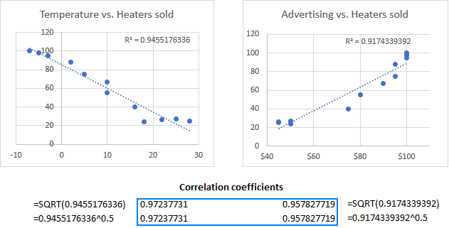
For our sample data set, the correlation graphs look like shown in the image below. Additionally, we displayed R-squared value, also called the Coefficient of Determination. This value indicates how well the trendline corresponds to the data - the closer R2 to 1, the better the fit.
From the R2 value displayed on your scatterplot, you can easily calculate the correlation coefficient:
- For better accuracy, get Excel to show more digits in the R-squared value than it does by default.
- Click the R2 value on the chart, select it using the mouse, and press Ctrl + C to copy it.
- Get a square root of R2 either by using the SQRT function or by raising the copied R2 value to the power of 0.5.
For example, the R2 value in the second graph is 0.9174339392. So, you can find the correlation coefficient for Advertising and Heaters sold with one of these formulas:
=SQRT(0.9174339392)
=0.9174339392^0.5
As you can make sure, the coefficients calculated in this way are perfectly in line with the correlation coefficients found in the previous examples, except the sign:
Potential problems with correlation in Excel
The Pearson Product Moment Correlation only reveals a linear relationship between the two variables. Meaning, your variables may be strongly related in another, curvilinear, way and still have the correlation coefficient equal to or close to zero.
The Pearson correlation is not able to distinguish dependent and independent variables. For example, when using the CORREL function to find the association between an average monthly temperature and the number of heaters sold, we got a coefficient of -0.97, which indicates a high negative correlation. However, you could switch around the variables and get the same result. So, someone may conclude that higher heater sales cause temperature to fall, which obviously makes no sense. Therefore, when running correlation analysis in Excel, be aware of the data you are supplying.
Besides, the Pearson correlation is very sensitive to outliers. If you have one or more data points that differ greatly from the rest of the data, you may get a distorted picture of the relationship between the variables. In this case, you'd be wise to use the Spearman rank correlation instead.
That's how to do correlation in Excel. To have a closer look at the examples discussed in this tutorial, you are welcome to download our sample workbook below. I thank you for reading and hope to see you on our blog next week!
Practice workbook
Calculate Correlation in Excel (.xlsx file)
 by
by
2 comments
I get different results while working with the same data via correlation formula and multiple correlation coefficients.Please ans. why this is so?
GG ma' lady