The tutorial shows how to insert vertical line in Excel chart including a scatter plot, bar chart and line graph. You will also learn how to make a vertical line interactive with a scroll bar.
In the modern versions of Excel, you can add a horizontal line to a chart with a few clicks, whether it's an average line, target line, benchmark, baseline or whatever. But there is still no easy way to draw a vertical line in Excel graph. However, "no easy way" does not mean no way at all. We will just have to do a little lateral thinking!
How to add vertical line to scatter plot
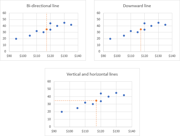
To highlight an important data point in a scatter chart and clearly define its position on the x-axis (or both x and y axes), you can create a vertical line for that specific data point like shown below:
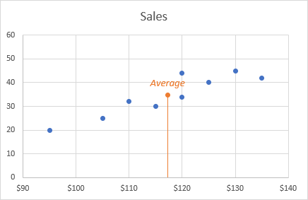
Naturally, we are not going to "tie" a line to the x-axis because we don't want to reposition it every time the source data changes. Our line will be dynamic and will react to any data changes automatically.
To add a vertical line to Excel scatter chart, this is what you need to do:
- Select your source data and create a scatter plot in the usual way (Inset tab > Chats group > Scatter).
- Enter the data for the vertical line in separate cells. In this example, we are going to add a vertical average line to Excel chart, so we use the AVERAGE function to find the average of x and y values like shown in the screenshot:
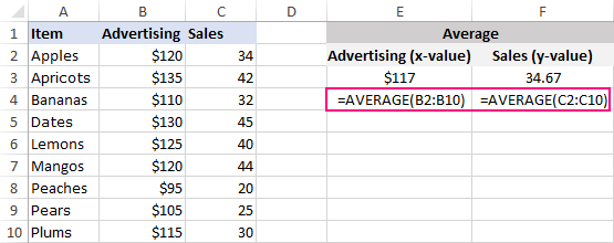
Note. If you'd like to draw a line at some existing data point, extract its x and y values as explained in this tip: Get x and y values for a specific data point in a scatter chart.
- Right-click anywhere in your scatter chart and choose Select Data… in the pop-up menu.
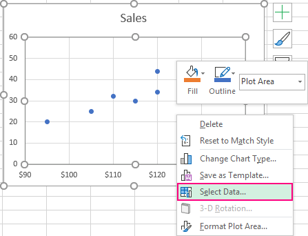
- In the Select Data Source dialogue window, click the Add button under Legend Entries (Series):
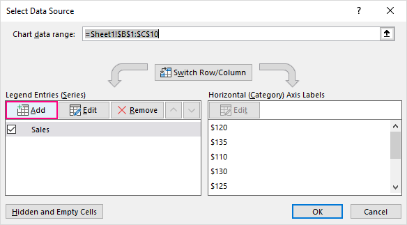
- In the Edit Series dialog box, do the following:
- In the Series name box, type a name for the vertical line series, say Average.
- In the Series X value box, select the independentx-value for the data point of interest. In this example, it's E2 (Advertising average).
- In the Series Y value box, select the dependenty-value for the same data point. In our case, it's F2 (Sales average).
- When finished, click OK twice to exist both dialogs.
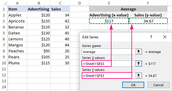
Note. Be sure to delete the existing contents of the Series values boxes first - usually a one element array like ={1}. Otherwise, the selected x and/or y cell will be added to the existing array, which will lead to an error.
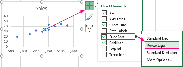
- Select the new data point in your chart (orange in our case) and add the Percentage error bars to it (Chart Elements button > Error Bars > Percentage).
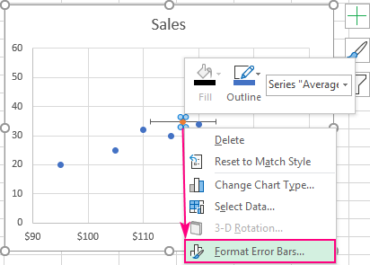
- Right-click on the vertical error bar and choose Format Error Bars… from the context menu.
- On the Format Error Bars pane, switch to the Error Bar Options tab (the last one) and set Percentage to 100. Depending on your needs, set Direction to one of the following:
- Set Direction to Both if you'd like the vertical line to go upwards and downwards from the data point.
- Change Direction to Minus for the vertical line to go only downwards from the data point.

- Click the horizontal error bar and do one of the following:
- To hide the horizontal error bars, set Percentage to 0.
- To display a horizontal line in addition to the vertical line, set Percentage to 100 and choose the desired Direction.
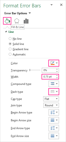
- Finally, switch to the Fill & Line tab and choose the Color and Dash type for the currently selected error bar. You can also make the line thinner or thicker by changing its Width.
Done! A vertical line is plotted in your scatter graph. Depending on your settings in steps 8 and 9, it will look like one of these images:
How to add vertical line to Excel bar chart
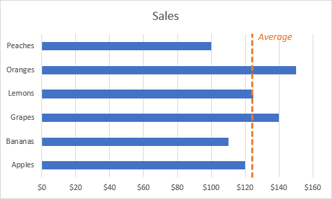
If you'd like to compare the real values with the average or target you wish to achieve, insert a vertical line in a bar graph like shown in the screenshot below:
To create a vertical line in your Excel chart, please follow these steps:
- Select your data and make a bar chart (Insert tab > Charts group > Insert Column or Bar chart > 2-D Bar).
- In some empty cells, set up the data for the vertical line like shown below.
X Y Value / formula 0 Value / formula 1 Since we are going to draw a vertical average line, we calculate the X value as the average of cells B2 through B7:
=AVERAGE($B$2:$B$7)This formula is inserted in both X cells (D2 and D3). Please notice that we use absolute cell references to ensure that the formula copies to a second cell without changes.

- Right click anywhere in your bar chart and click Select Data in the context menu:

- In the popped-up Select Data Source dialog, click the Add button:

- In the Edit Series dialog box, make the following changes:
- In the Series name box, type the desired name (Average in this example).
- In the Series values box, select the cells with your X values (D2:D3 in our case).
- Click OK twice to close both dialogs.

- The new data series is now added to your bar chart (two orange bars). Right click it and pick Change Series Chart Type in the pop-up menu.

- In the Change Chart Type dialog window, do one of the following depending on your Excel version:
- In Excel 2013 and later, select Combo on the All Charts tab, choose Scatter with Straight Lines for the Average series, and click OK to close the dialog.
- In Excel 2010 and earlier, select X Y (Scatter) > Scatter with Straight Lines, and click OK.

- In the result of the above manipulation, the new data series transforms into a data point along the primary y-axis (more precisely two overlapping data points). You right-click the chart and choose Select Data again.

- In the Select Data dialog, select the Average series and click the Edit button.

- In the Edit Series dialog box, do the following:
- For Series X values, select two X cells with your Average formulas (D2:D3).
- For Series Y values, select two Y cells containing 0 and 1 (E2:E3).
- Click OK twice to exit both dialogs.
Note. Before selecting the cells with your X and Y values, please remember to clear the corresponding box first to prevent errors.

A vertical line appears in your Excel bar chart, and you just need to add a few finishing touches to make it look right.
- Double-click the secondary vertical axis, or right-click it and choose Format Axis from the context menu:
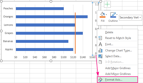
- In the Format Axis pane, under Axis Options, type 1 in the Maximum bound box so that out vertical line extends all the way to the top.

- Hide the secondary y-axis to make your chart look cleaner. For this, on the same tab of the Format Axis pane, expand the Labels node and set Label Position to None.

That's it! Your bar chart with a vertical average line is finished and good to go:

Tips:
- To change the appearance of the vertical line, right click it, and select Format Data Series in the context menu. This will open the Format Data Series pane, where you can choose the desired dash type, color, etc. For more information, please see How to customize the line in Excel chart.
- To add a text label for the line like shown in the image at the beginning of this example, please follow the steps described in How to add a text label for the line.
How to add vertical line to line chart in Excel
To insert a vertical line in a line graph, you can use either of the previously described techniques. For me, the second method is a bit faster, so I will be using it for this example.
To add a vertical line to an Excel line chart, carry out these steps:
- Select your source data and make a line graph (Inset tab > Chats group > Line).
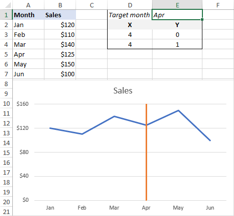
- Set up the data for the vertical line in this way:
- In one cell (E1), type the text label for the data point at which you want to draw a line exactly as it appears in your source data.
- In two other cells (D3 and D4), extract the X value for the target data point by using this formula:
=IFERROR(MATCH($E$1,$A$2:$A$7,0), 0)The MATCH function returns the relative position of the lookup value in the array, and the IFERROR function replaces a potential error with zero when the lookup value is not found.
- In two adjacent cells (E3 and E4), enter the Y values of 0 and 1.

With the vertical line data in place, please follow steps 3 - 13 from the bar chart example to plot a vertical line in your chart. Below, I will briefly walk you through the key points.
- Right-click anywhere in the chart, and then click Select Data… .
- In the Select Data Source dialogue box, click the Add button.
- In the Edit Series window, type any name you want in the Series name box (e.g. Vertical Line), and select the cells with X values for the Series values box (D3:D4 in our case).

- Right click anywhere in the chart and choose Change Chart Type from the pop-up menu.
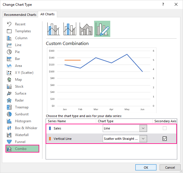
- In the Change Chart Type window, make the following changes:
- On the All Charts tab, select Combo.
- For the main data series, choose the Line chart type.
- For the Vertical Line data series, pick Scatter with Straight Lines and select the Secondary Axis checkbox next to it.
- Click OK.
- Right-click the chart and choose Select Data…
- In the Select Data Source dialog box, select the Vertical Line series and click Edit.

- In the Edit Series dialog box, select the X and Y values for the corresponding boxes, and click OK twice to exit the dialogs.

- Right-click the secondary y-axis on the right, and then click Format Axis.
- On the Format Axis pane, under Axis Options, type 1 in the Maximum bound box to ensure that your vertical line extends to the top of the chart.
- Hide the right y-axis by setting Label Position to None.
Your chart with a vertical line is done, and now it's time to try it out. Type another text label in E2, and see the vertical line move accordingly.
Don't want to bother typing? Fancy up your graph by adding a scroll bar!
Make a vertical line interactive with scroll bar
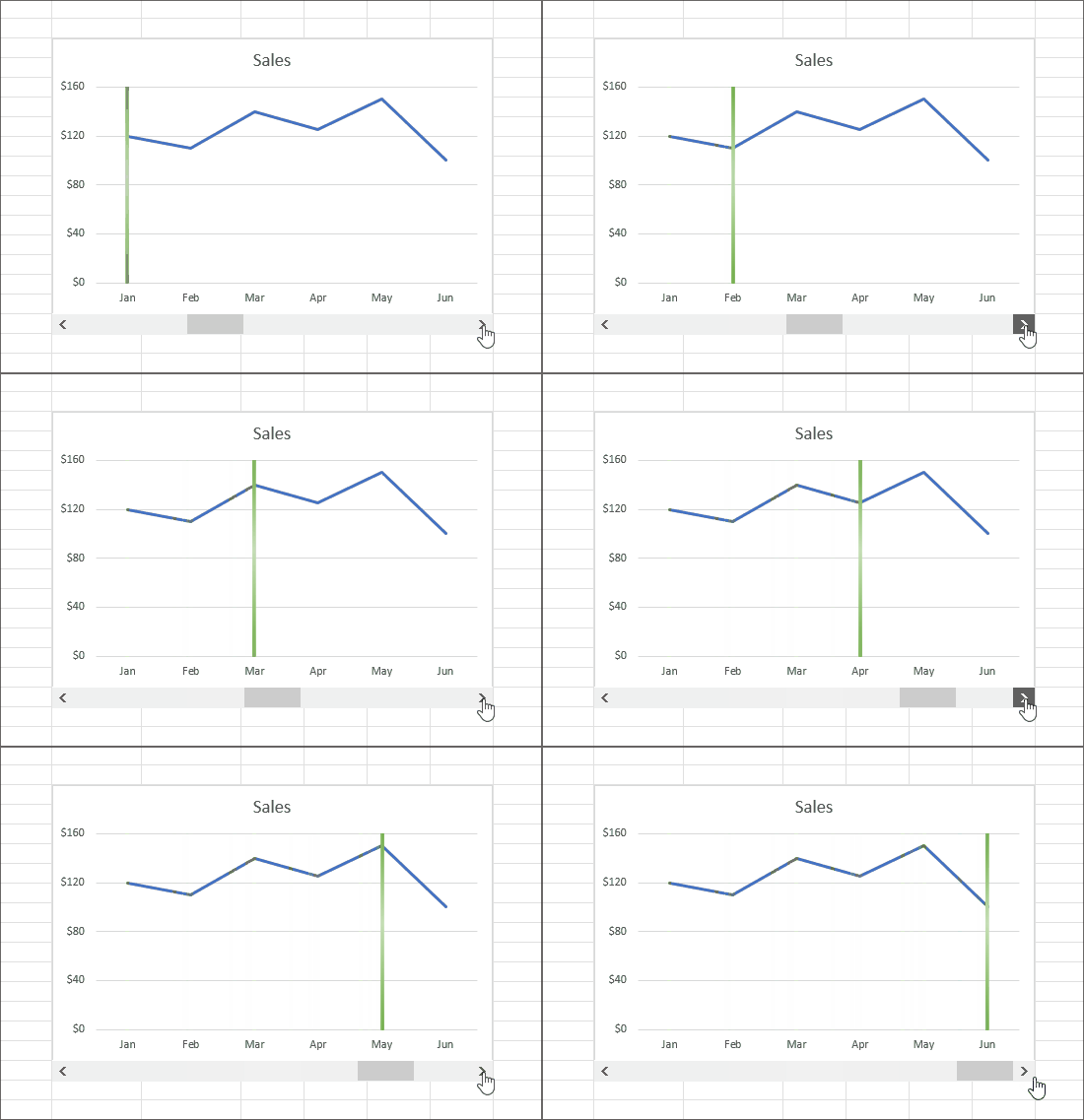
To interact with the chart directly, you insert a scroll bar and connect your vertical line to it like shown below.
For this, you will need the Developer Tab. If you don't have it on your Excel ribbon yet, it is very easy to enable: right-click the ribbon, click Customize Ribbon, select Developer under Main Tabs, and click OK.
And now, perform these simple steps to insert a scroll bar:
- On the Developer tab, in the Controls group, click the Insert button, and then click Scroll Bar under Form Controls:

- On top or at the bottom of your graph (depending on where you want the scroll bar to appear), draw a rectangle of the desired width using the mouse. Or simply click anywhere on your sheet, and then move and resize the scroll bar as you see fit.
- Right click the scroll bar and click Format Control….

- Link your scroll bar to some empty cell (D5), set the Maximum Value to the data points total and click OK. We have data for 6 months, so we set the Maximum Value to 6.

- The linked cell now shows the value of the scroll bar, and we need to pass that value to our X cells in order to bind the vertical line to the scroll bar. So, delete the IFERROR/MATCH formula from cells D3:D4 and enter this simple one instead:
=$D$5

The Target month cells (D1 and E1) are not needed any longer, and you are free to delete them. Or, you can return the target month by using the below formula (which goes to cell E1):
=IFERROR(INDEX($A$2:$A$7, $D$5, 1), "")
That's it! Our interactive line chart is completed. That has taken quite a bit of time, but it's worth it. Do you agree?

That's how you create a vertical line in Excel chart. For hands-on experience, please feel free to download our sample workbook below. I thank you for reading and hope to see you on our blog next week!
Practice workbook for download
Excel Vertical Line - examples (.xlsx file)
 by
by
22 comments
This article is great. I made great charts thanks to this.
Thank you very much for sharing!!!
Why does excel make things so complicated... I got lost half way through this. Making a video of the various steps might help
Hi Svetlana,
Do you have a ready made chart with instructions which can do the following:
"Add a dynamic vertical line to an Excel Break-even Point chart."
1. The dynamic vertical line is located exactly at the junction of the other 3 axes.
2. The dynamic vertical line is also touching the horizontal axe at the precise date when the BeP is happening.
If not, please give me your professional fee for this service which will be paid by banker's tranfer directly to your bank account.
Best regards,
Ivan
Thank You for this nice explanation.
Hi All,
I am trying to do something similar, but I want to create lines across the same data set, one with a maximum and one with a minimum line, so that the scatter falls within the ranges......
I've tried so many ways, but still unable to get there, if there are any experts, please get in touch.
Thank you
On the scatter plots for error bars, I've made them 100% but because my value starts at 16%, the 100% only takes me 3/4 of the way across the data and doesn't stretch out to the 100% axis on the graph. Why?
Absoluety billiant - thanks
You are a legend thanks so much for your tutorial, very helpful xxx
Thank you! It helped me finish my assignment .
Thanks a lot! Your tutorial is detail just right and clear enough. It took me 10 minutes to create 6 milestone dates on my stacked bar chart. Bravo!!
Thanks!! Great and easy steps
Excellent! Great visuals. Thank you.
A helpful way to make a silk purse (the line) from a pig's ear (Excel's sub-standard features).
Thank you Svetlana, for posting such a detailed tutorial. It was helpful. Earlier I used to create this line manually and use to consume lot of time. This automated the whole think.
This is an awesome and thorough article. I have been pulling my hair out trying to put today's date on a horizontal bar chart I use as a project plan and after browsing multiple sites I only found this article to demonstrate the solution without impacting the format of my existing chart. Thank you!!!
My excel is not showing "Combo"
This is fantastic! Just wanted to say thanks for the very clear and helpful instructions. Made a nice graph today based on this site.
How to add numbers on the chart where the lines are already created ??
Excellent!
I am writing a dissertation for uni and this solved one of my problems (I used to copy the graph to word and then draw a line where I wanted it!).
My other problem is marking a range. I have date for a range of years (1980-2019), how can I mark in a similar way the period 2008-2011?
Many thanks
Great and useful instructions! Thank you so much! Looking forward for more.