The tutorial explains how to do trend analysis in Excel: how to insert a trendline in a chart, display its equation and get the slope of a trendline.
When plotting data in a graph, you may often want to visualize the general trend in your data. This can be done by adding a trendline to a chart. Luckily, Microsoft Excel has made inserting a trend line very easy, especially in newer versions. Nevertheless, there are a few little secrets that make a big difference, and I will share them with you in a moment.
Trendline in Excel
A trendline, also referred to as a line of best fit, is a straight or curved line in a chart that shows the general pattern or overall direction of the data.
This analytical tool is most often used to show data movements over a period of time or correlation between two variables.
Visually, a trendline looks somewhat similar to a line chart, but it doesn't connect the actual data points as a line chart does. A best-fit line shows the general trend in all the data, ignoring statistical errors and minor exceptions. In some cases, it can also be used to forecast trends.
Excel graphs that support trendlines
A trendline can be added to a variety of Excel charts, including XY scatter, bubble, stock, as well as unstacked 2-D bar, column, area and line graphs.
You cannot add a trendline to 3-D or stacked charts, pie, radar and similar visuals.
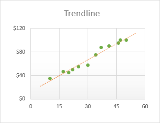
Below, there is an example of a scatter plot with an extended trendline:
How to add a trendline in Excel
In Excel 2019, Excel 2016 and Excel 2013, adding a trend line is a quick 3-step process:
- Click anywhere in the chart to select it.
- On the right side of the chart, click the Chart Elements button (the cross button), and then do one of the following:
- Check the Trendline box to insert the default linear trendline:
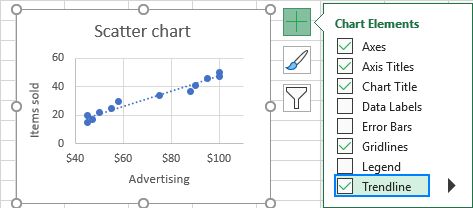
- Click the arrow next to the Trendline box and choose one of the suggested types:
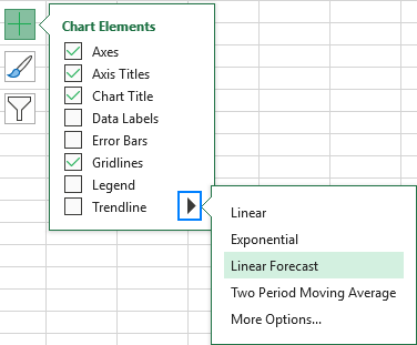
- Click the arrow next to Trendline, and then click More Options. This will open the Format Trendline pane, where you switch to the Trendline Options tab to see all the trend line types available in Excel and choose the one you want. The default Linear trendline will be pre-selected automatically. Optionally, you can also display the trendline equation in the chart.

- Check the Trendline box to insert the default linear trendline:
Tip. Another quick way to add trendline to an Excel chart is to right-click the data series and then click Add Trendline….
How to make a trendline in Excel 2010
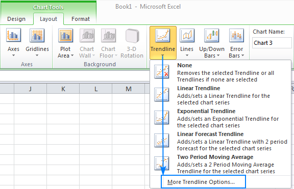
To add a trendline in Excel 2010, you follow a different route:
- On a chart, click the data series for which you want to draw a trendline.
- Under Chart Tools, go to the Layout tab > Analysis group, click Trendline and either:
- Pick one of the predefined options, or
- Click More Trendline Options…, and then choose the trendline type for your chart.
How to insert multiple trendlines in the same chart
Microsoft Excel allows adding more than one trendline to a chart. There are two scenarios that should be handled differently.
Add a trendline for each data series
To put a trendline on a chart that has two or more data series, here's what you do:
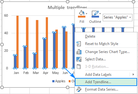
- Right-click the data points of interest (blue ones in this example) and choose Add Trendline… from the context menu:
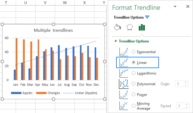
- This will open the Trendline Options tab of the pane, where you can choose the desired line type:
- Repeat the above steps for the other data series.
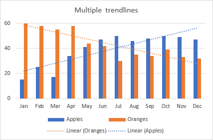
As the result, each data series will have its own trendline of the matching color:
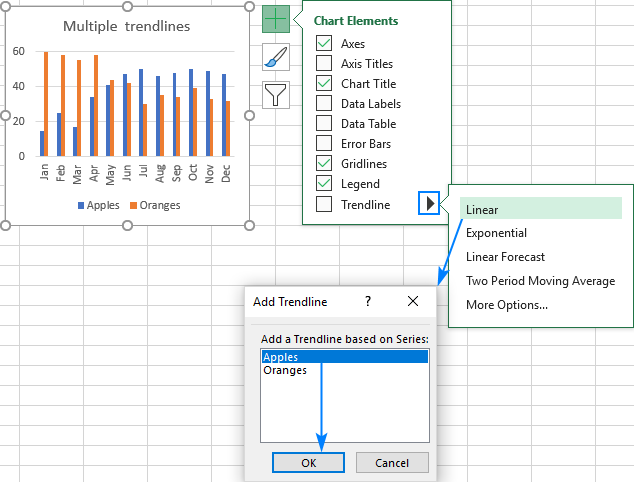
Alternatively, you can click the Chart Elements button, then click the arrow next to Trendline and choose the type you want. Excel will show a list of the data series plotted in your chart. You pick the needed one and click OK.
Draw different trendline types for the same data series
To make two or more different trendlines for the same data series, add the first trendline as usual, and then do one of the following:
- Right-click the data series, select Add Trendline… in the context menu, and then choose a different trend line type on the pane.
- Click the Chart Elements button, click the arrow next to Trendline and choose the type you want to add.
Either way, Excel will display multiple trendlines in the chart, Linear and Moving average in our case, for which you can set different colors:

How to format a trendline in Excel
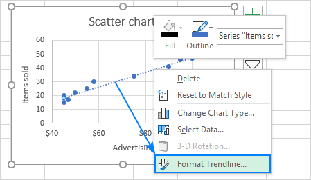
To make your graph even more understandable and easily interpreted, you may want to change the default appearance of a trendline. For this, right-click it and then click Format Trendline… . Or simply double-click the trendline to open the Format Trendline pane.
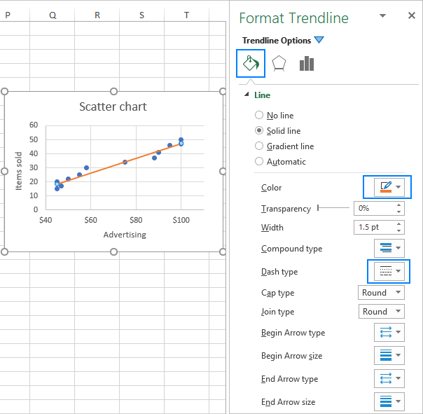
On the pane, switch to the Fill & Line tab and choose the color, width and dash type for your trendline. For example, you can make it a solid line rather than a dashed line:
How to extend trendline in Excel
To project the data trends into the future or past, this is what you need to do:
- Double-click the trendline to open the Format Trendline pane.
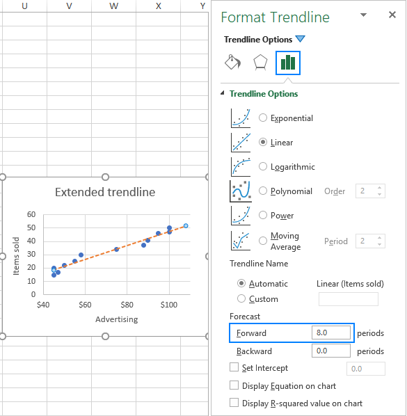
- On the Trendline Options tab (the last one), type the desired values in the Forward and/or Backward boxes under Forecast:
In this example, we choose to extend the trendline for 8 periods beyond the last data point:
Excel trendline equation
Trendline equation is a formula that mathematically describes the line that best fits the data points. The equations are different for different trendline types, though in every equation Excel uses the least squares method to find the best fit for a line though data points. You can find the equations for all Excel trendlines types in this tutorial.
When drawing the line of best fit in Excel, you can display its equation in a chart. Additionally, you can display the R-squared value.
R-squared value (Coefficient of Determination) indicates how well the trendline corresponds to the data. The closer the R2 value to 1, the better the fit.
How to display the trendline equation on a chart
To show the equation and R-squared value on a chart, do the following:
- Double-click the trendline to open its pane.
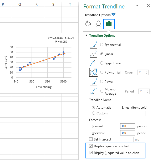
- On the pane, switch to the Trendline Options tab and check these boxes:
- Display Equation on chart
- Display R-squared value on chart
This will put the trendline formula and the R2 value at the top of your graph, and you are free to drag them wherever you see fit.
In this example, the R-squared value equals 0.957, which means that the trendline fits about 95% of data values.
Note. The equation displayed on an Excel chart is correct only for XY scatter plots. For more information, please see Why Excel trendline equation is wrong.
Show more digits in the trendline equation
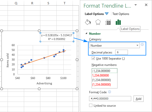
If the Excel trendline equation delivers inaccurate results when you supply x values to it manually, most likely it's because of rounding. By default, the numbers in the trendline equation are rounded to 2 - 4 decimal places. However, you can easily make more digits visible. Here's how:
- Select the trendline formula in the chart.
- On the Format Trendline Label pane that appears, go to the Label Options tab.
- In the Category drop-down list, select Number.
- In the Decimal places box, type the number of decimal places you want to show (up to 30) and press Enter to update the equation in the chart.
How to find the slope of a trendline in Excel
To get the slope of the linear trendline, Microsoft Excel provides a special function of the same name:
Where:
- Known_y's is a range of the dependent data points plotted on the y-axis.
- Known_x's is a range of the independent data points plotted on the x-axis.
With the x values in B2:B13 and the y values in C2:C13, the formula goes as follows:
=SLOPE(C2:C13, B2:B13)
The slope can also be calculated by using the LINEST function in a regular formula:
=LINEST(C2:C13,B2:B13)
If entered as an array formula by pressing Ctrl + Shift + Enter, it would return the slope of the trendline and y-intercept into two adjacent cells in the same row. For more information, please see How to use the LINEST function in Excel.
As you can see in the following screenshot, the slope value returned by the formulas exactly matches the slope coefficient in the linear trendline equation displayed in our graph:

The coefficients of other trendline equation types (Exponential, Polynomial, Logarithmic, etc.) can also be calculated, but you'd need to use more complex formulas explained in Excel trendline equations.
How to delete a trendline in Excel
To remove a trendline from your chart, right-click the line, and then click Delete:

Or click the Chart Elements button and unselect the Trendline box:
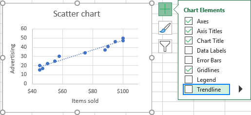
Either way, Excel will immediately remove the trendline from a chart.
That's how to do a trendline in Excel. I thank you for reading and hope to see you on our blog next week!
 by
by
13 comments
this was no help. none of your instructions provided resolution. simply adding a trendline on a pc is the issue. no + image is next to the chart, there is no tool under chart that is trendline, right clicking the data, format, does not give that option...
Hello Josh,
Please be sure to follow our instructions closely:
1. Click anywhere in the chart to select it.
2. On the right side of the chart you will see 3 buttons. Click the cross button, which is called the Chart Elements button.
3. Under Chart Elements, put a tick in the Trendline check box (the last one).
That's it. Please see the "How to add a trendline in Excel" section for the detailed instructions with screenshots. If your chart has several data series, please check out "How to insert multiple trendlines in the same chart".
Hey Svetlana,
No, he’s right. This article was no help. What if you have a simple graph with two data sets, and want to plot a linear regression for both of them? That makes your entire guide obsolete. You explanations are also hard to grasp anyone giving this positive reviews is just clueless and needed very. Very. Very basic help.
Hey Drew,
> What if you have a simple graph with two data sets, and want to plot a linear regression for both of them?
The section "How to insert multiple trendlines in the same chart" covers exactly this case.
The question is more like: How to insert multiple trendlines at once. When you have 5+ datasets in a chart it gets tedious to repeat the insert steps multiple times.
How can I transfer the trendline equation which is shown on the chart to an Excel cell external to the chart area to use it for calculation
My question is really the same as yours, David.
Trendlines are simple to set up with scatter points, and adding the equation is also just done by clicking on the radio button. I just cant connect them to an Excel cell and make them live.
Currently I use a trick to get the equation in an Excel cell, which is as follows: I click on the equation and copied it only from the = sign to the right. I then paste the equation in the Excel cell. Next I highlight each X in the equation then the other Excel cell I use for my normal calculation, to make the X reference this cell. In front of each X you must add a "*" and after each "X" a "^". I hope this makes sense? The copied formula now becomes live with the referenced cell. So Calculations can work.
The problem I have is if my trendline data changes the chart formula will change and my copied and referenced formula becomes obsolete.
My real question is how can I get these formula onto an Excel cell and keep them live to the chart?
which trendline should i use to show temperature change of 43 years?
Hi Tanvir,
I'd advise to try different trendline types and compare their R2 to see which one is more accurate (the nearer R2 is to 1, the better the trend line fits the data). For more information, please see Excel trendline types.
Hi Svetlana, can we add multiple trendlines to a pivot chart?
Hi Roja,
Sure, you can. The steps are the same as described in How to insert multiple trendlines in the same chart.
Hi Svetlana--
Thank you. My trend line function is an exponential decay, essentially just like the "wild tigers" illustration you showed. I was looking for more digits in my trend line function, so your explanation above worked well...but only for the pre-factor. The exponent is still displayed only as a single digit, so having asked for 4 decimal places in "number" I still have something like 0.4059e^-7E-04x displayed (except that I used the carrot top to indicate superscript). I need more digits on the exponent, so that it would be something like 7.1234E-04. Also, what does the "x" at the end mean? Incidentally, when I use "solver" with a least squares fit, I get slightly different numbers, which is also a puzzle.
Hi Ned,
As you may remember, the exponential trendline equation is as follows: y = aebx
Where x is an independent variable plotted on the x-axis; a and b are calculated coefficients and e is the constant (base of the natural logarithm).
In your case, the b coefficient is displayed using a scientific notation that replaces part of the number with E+n, where E multiplies the preceding number by 10 to the nth power. That is:
7E-04 = 7*10^-4 = 0.0007 (exactly 4 digits as you requested)
Given the above, the equation can be re-written in the traditional form:
0.4059e-0.0007x