A while ago we published the first part of our Excel charts tutorial that provides the detailed guidance for beginners. And the very first question posted in comments was this: "And how do I created a chart from multiple tabs?" Thanks for this great question, Spencer!
Indeed, when creating charts in Excel, the source data does not always reside on the same sheet. Fortunately, Microsoft Excel provides a way to plot data from two or more different worksheets in a single graph. The detailed steps follow below.
How to create a chart from multiple sheets in Excel
Supposing you have a few worksheets with revenue data for different years and you want to make a chart based on those data to visualize the general trend.
1. Create a chart based on your first sheet
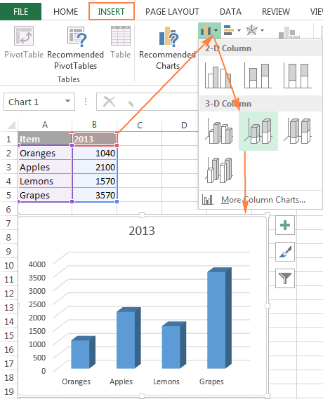
Open your first Excel worksheet, select the data you want to plot in the chart, go to the Insert tab > Charts group, and choose the chart type you want to make. In this example, we will be creating the Stack Column chart:
2. Add a second data series from another sheet
Click on the chart you've just created to activate the Chart Tools tabs on the Excel ribbon, go to the Design tab (Chart Design in Excel 365), and click the Select Data button.
Or, click the Chart Filters button ![]() on the right of the graph, and then click the Select Data… link at the bottom.
on the right of the graph, and then click the Select Data… link at the bottom.
In the Select Data Source window, click the Add button.
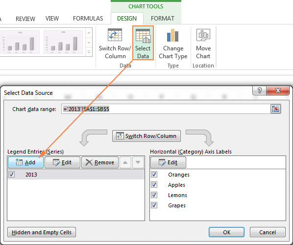
Now we are going to add the second data series based on the data located on a different worksheet. This is the key point, so please be sure to follow the instructions closely.
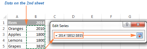
Clicking the Add button opens the Edit Series dialog window where you click the Collapse Dialog button next to the Series values field.

The Edit Series dialog will shrink to a narrow range selection window. Click on the tab of the sheet that contains the other data you want to include in your Excel chart (the Edit Series window will remain on-screen as you navigate between sheets).
On the second worksheet, select a column or a row of data you want to add to your Excel graph, and then click the Expand Dialog icon to get back to the full-sized Edit Series window.
And now, click the Collapse Dialog button to the right of the Series name field and select a cell containing the text you want to use for the series name. Click the Expand Dialog to return to the initial Edit Series window.
Make sure the references in Series name and Series value boxes are correct and click the OK button.
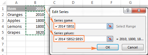
As you see in the screenshot above, we've linked the series name to cell B1, which is a column name. Instead of the column name, you can type your own series name in double quotes, e.g. ="Second data series".
The series names will appear in chart legend of your chart, so you might want to invest a couple of minutes in giving some meaningful and descriptive names for your data series.
At this point, the result should look similar to this:
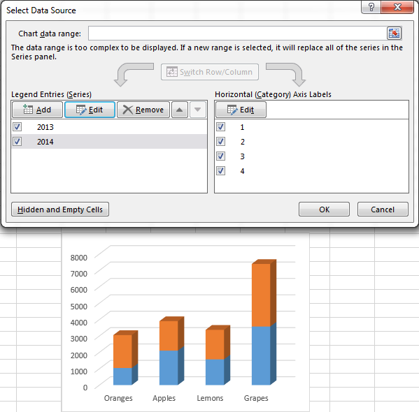
3. Add more data series (optional)
If you want to plot data from multiple worksheets in your graph, repeat the process described in step 2 for each data series you want to add. When done, click the OK button on the Select Data Source dialog window.
In this example, I've added the 3rd data series, here's how my Excel chart looks now:
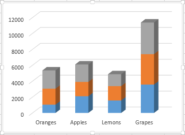
4. Customize and improve the chart (optional)
When creating charts in Excel 2013 and 2016, usually the chart elements such as chart title and legend are added by Excel automatically. For our chart plotted from several worksheets, the title and legend were not added by default, but we can quickly remedy this.
Select your graph, click the Chart Elements button (green cross) in the top right corner, and select the options you want:
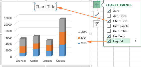
For more customization options, such as adding data labels or changing the way the axes are displayed in your chart, please check out the following tutorial: Customizing Excel charts.
Making a chart from the summary table
The solution demonstrated above works only if your entries appear in the same order in all the worksheets you want to plot in the chart. Otherwise, your graph is going not be messed up.
In this example, the order of entries (Oranges, Apples, Lemons, Grapes) is identical in all 3 sheets. If you are making a chart from large worksheets and you are not sure about the order of all items, it makes sense to create a summary table first, and then make a chart from that table. To pull the matching data to a summary table, you can use the VLOOKUP function or the Merge Tables Wizard.
For instance, if the worksheets discussed in this example had a different order of items, we could make a summary table using the following formula:
=VLOOKUP(A3,'2014'!$A$2:$B$5, 2,FALSE)
And got the following result:
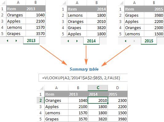
And then, simply select the summary table, go to the Insert tab > Charts group and choose the chart type you want.
Modify an Excel chart built from multiple sheets
After making a chart based on the data from two or more sheets, you might realize that you want it to be plotted differently. And because creating such charts is not an instant process like making a graph from one sheet in Excel, you may want to edit the existing chart rather than create a new one from scratch.
In general, the customization options for Excel charts based on multiple sheets are the same as for usual Excel graphs. You can use the Charts Tools tabs on the ribbon, or right-click menu, or chart customization buttons in the top right corner of your graph to change the basic chart elements such as chart title, axis titles, chart legend, chart styles, and more. The detailed step-by-step instructions are provided in Customizing Excel charts.
And if you want to change the data series plotted in the chart, there are three ways to do this:
Edit data series using Select Data Source dialog
Open the Select Data Source dialog window (Design tab > Select Data).
To change a data series, click on it, then click the Edit button and modify the Series Name or Series Values like we did when adding a data series to the chart.
To change the order of series in the chart, select a series and use the Up and Down arrows to move that series up or down.
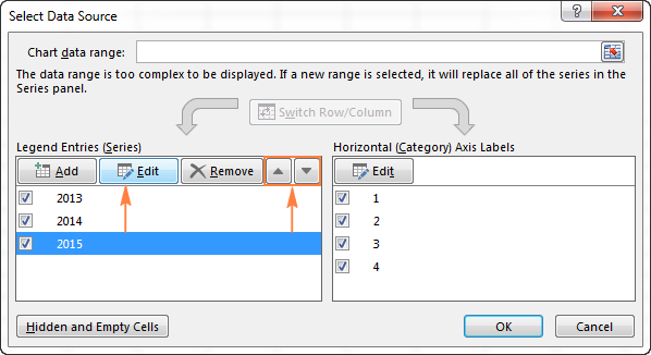
To hide a data series, simply uncheck it in the Legend Entries (Series) list in the left-hand side of the Select Data Source dialog.
To delete a certain data series from the chart permanently, select that series and click the Remove bottom.
Hide or show series using the Charts Filter button
Another way to manage the data series displayed in your Excel chart is using the Chart Filters button ![]() . This button appears on the right of your chart as soon as you click on it.
. This button appears on the right of your chart as soon as you click on it.
To hide certain data, click on the Chart Filters button, and uncheck the corresponding data series or categories.
To edit a data series, click the Edit Series button to the right of the series name. The good old Select Data Source dialog window will come up, and you can make the necessary changes there. For the Edit Series button to appear, you just need to hover over a series name with the mouse. As soon as you do this, the corresponding series will get highlighted on the chart, so you will clearly see exactly what element you are going to change.

Edit a data series using a formula
As you probably know, each data series in an Excel chart is defined by the formula. For example, if you select one of the series in the graph we created a moment ago, the series formula will look as follows:
=SERIES('2013'!$B$1,'2013'!$A$2:$A$5,'2013'!$B$2:$B$5,1)
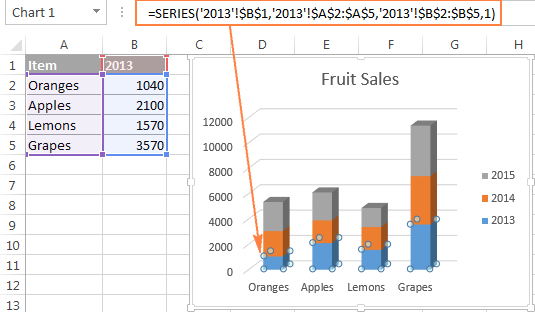
Each data series formula can be broken up into four basic elements:
=SERIES([Series Name], [X Values], [Y Values], [Plot Order])
So, our formula can be interpreted in the following way:
- Series name ('2013'!$B$1) is taken from cell B1 on sheet "2013".
- Horizontal axis values ('2013'!$A$2:$A$5) are taken from cells A2:A5 on sheet "2013".
- Vertical axis values ('2013'!$B$2:$B$5) are taken from cells B2:B5 on sheet "2013".
- Plot Order (1) indicates that this data series comes first in the chart.
To modify a certain data series, select it on the chart, go to the formula bar and make the necessary changes there. Of course, you need to be very careful when editing a series formula because this might be an error-prone way, especially if the source data is located on a different worksheet and you cannot see it when editing the formula. And still, if you feel more comfortable with Excel formulas than with user interfaces, you may like this way to quickly make small edits in Excel charts.
That's all for today. I thank you for your time and hope to see you on our blog next week!
 by
by
8 comments
Can you make a tutorial on how to make a line graph taking data from multiple tabs into one line graph? For example I have a spreadsheet with tabs of sales for apples, bananas, and coconut by month. I would like to graph total sales of apples for the year. Can I pull the totals from each tab to create one graph?
This may be confusing. I hope it made sense.
I have a similar question as regarding graph's.
I Keep a daily log of my investment portfolios for 5 trading markets and wish to see the history plotted on a single chart to display the performanc.
Helpful tip to add: before the design menu will appear for use in step 1 (at least in some versions of excel), it's necessary to create a table (by selecting cells and insert tab > table).
Hi!
The Design tab in Excel is context-sensitive. For a table, it shows table-specific features, and for a chart - chart-specific. To activate the tab, you just need to select a corresponding object, chart in our case.
To avoid confusion, in the current version of Excel 365, the tab is named "Chart Design".
I wanna create progressive R&E after each month, each month's R&E will be in diff worksheet, i want amount to change in progressive R&e as i in put amount in monthly R&E. please guide me
I have a similar request. I can email a sample of my data.
Have not been able to get this to work yet!
Is it possible to create a chart from multiple sheets that will automatically update when a new sheet of data is added?
yes