In this tutorial, you will learn how to simplify your common tasks and gain new insights with the Excel Quick Analysis tool.
Microsoft Excel is a powerful spreadsheet application that can handle various types of data, but sometimes, you need to quickly get insights without diving deep into complex functions and formulas. That's where the Quick Analysis tool comes into play. In this article, we'll explore what the Quick Analysis tool is, where to find it in Excel, how to enable it, and how to use it to perform common tasks with just a few clicks.
What is Excel Quick Analysis tool?
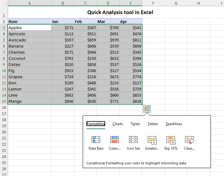
The Quick Analysis tool is a feature in Microsoft Excel that lets you easily access various data analysis options for a selected range. With just a few clicks, you can transform raw data into clear and concise tables, pivot tables, charts, sparklines, and other visual representations. Instead of navigating through multiple menus and dialog boxes, Quick Analysis offers a simple and convenient one-stop solution.
Where is the Quick Analysis tool in Excel?
Unlike traditional Excel features found on the ribbon or menus, the Quick Analysis tool operates in a more discreet manner.
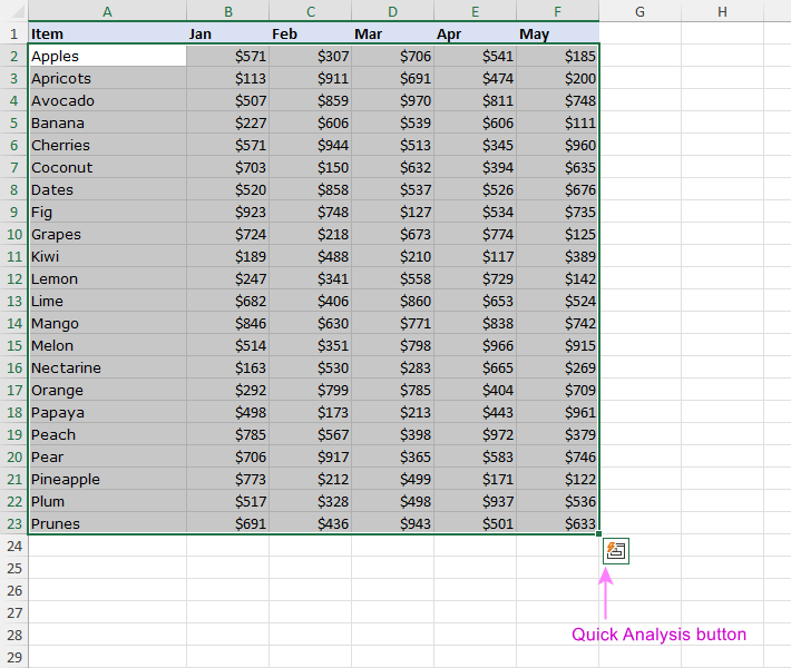
To access Quick Analysis in Excel, highlight a range of cells in your worksheet. In the bottom-right corner of the selected range, you'll notice a small icon that looks like a small box with a lightning bolt. This is the Quick Analysis button. Clicking this button will open the menu, where you can choose from different categories of features.
If the Quick Analysis button does not show up after selecting your data, use the Ctrl + Q shortcut to activate it.
It's important to remember that this button only becomes active for a specific data selection and does not appear when highlighting blank cells, entire columns or rows.
How to enable / disable Quick Analysis tool in Excel?
In some cases, you may not see the Quick Analysis icon when you select your data. If this happens, most likely this feature is disabled in your Excel, and you need to enable it manually in the Excel options. Here's how:
- Click on the File tab on the left side of the Excel ribbon.
- Select Options at the bottom of the left-hand panel.
- In the Excel Options window, navigate to the General section and tick the checkbox labeled Show Quick Analysis options on selection.
- Click OK to save your preferences.
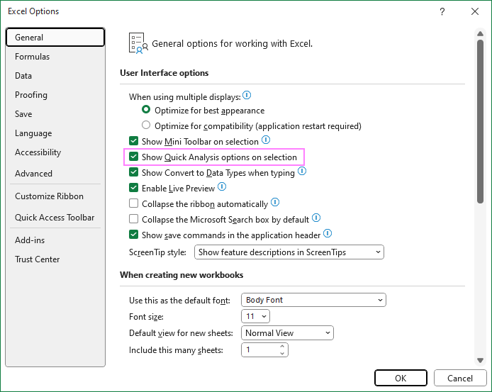
Now, the Quick Analysis button should be visible whenever you select a range of data, providing quick access to its functionality.
Tip. To prevent the Quick Analysis tool from appearing every time you select data and interrupting your workflow, simply uncheck the Show Quick Analysis Options on Selection tick box to toggle it off.
How to use Quick Analysis tool in Excel
Using the Quick Analysis tool is an intuitive and user-friendly process. The steps are:
- Begin by selecting the data you wish to analyze. This could be a table, a list of numbers or text strings, or any relevant dataset.
- Shift your focus to the bottom-right corner of the selected range and click the Quick Analysis button. In case the icon isn't visible, press Ctrl + Q to summon it.
- In the Quick Analysis menu, you'll discover a few categories of features tailored for your data analysis needs. Hover over a specific option to see a preview of how it will transform your data. When you click on the option, it will be immediately applied to your data.
Feel free to experiment with different features to see which one provides the most valuable insights for your worksheet. You can also undo or redo any changes you make using the Quick Access buttons or shortcuts.
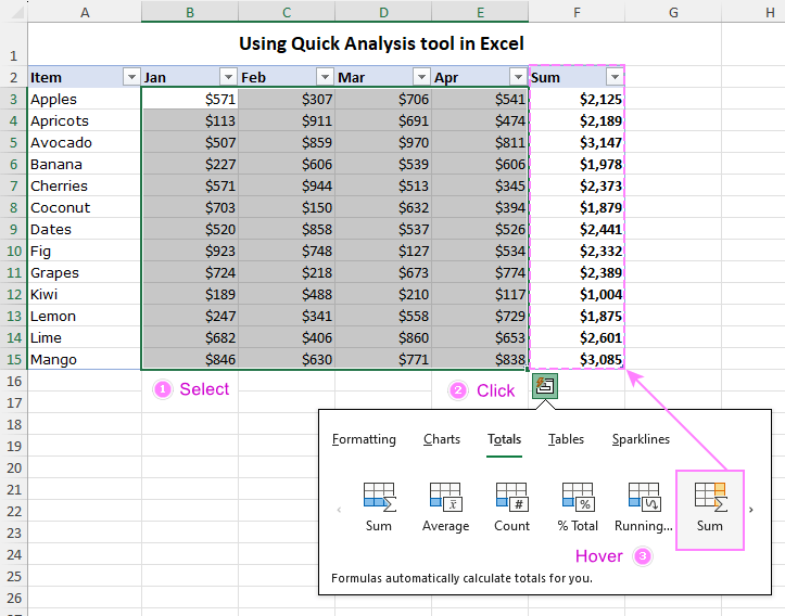
Below is an overview of the 5 main categories within the Quick Analysis tool. For those who prefer to navigate apps without using the mouse, keyboard shortcuts are available for each category.
Formatting
This category allows you to enhance data visualization by applying conditional formatting. The available options depend on the data type you’ve selected:
- For numeric data, you can use Data Bars, Icon Sets, Greater Than, and Top 10%, to highlight the relevant numbers in your dataset.
- For text values, you’ll have Highlight Duplicates, Unique Values, Cells That Contain, or Exact Match to identify and filter your data based on text criteria.
- For dates, you’ll be able to highlight the ones occurring Last Month, Last Week as well as Greater Than, Less Than, or Equal To a particular date.
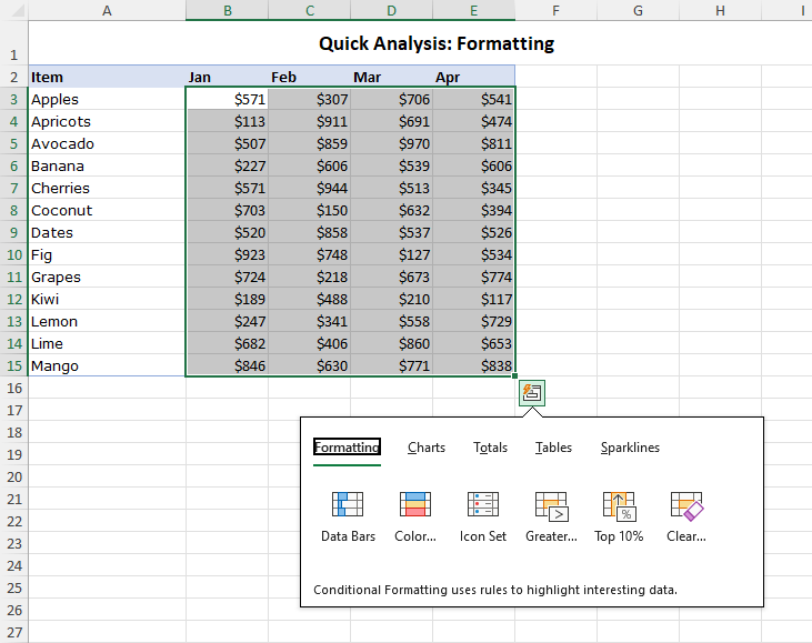
Keyboard shortcut for Quick Analysis Formatting: Ctrl + Q then F
Charts
Apart from the traditional ways to create charts in Excel, you can also use the Quick Analysis tool to insert a graph. While Quick Analysis provides a limited range of options, it intelligently suggests the most suitable chart types and makes the process faster.
Based on your selected data, Excel’s Quick Analysis tool will display the chart types that are the best fit to represent your data graphically and help you visualize the patterns, trends, and relationships. You can hover over each graph type to see a preview of how it would look like in your worksheet.
If the chart type you are looking for is not there, click on the More Charts option, which will open the Insert Chart dialog box, where you can select from a variety of other graph types, such as scatter plots, histograms, radar charts, and others.
This feature can help you create effective and attractive charts without spending too much time on formatting and customizing. However, if you want more control over the appearance and functionality of your charts, you can use the Chart Tools tab to access more advanced settings and features.
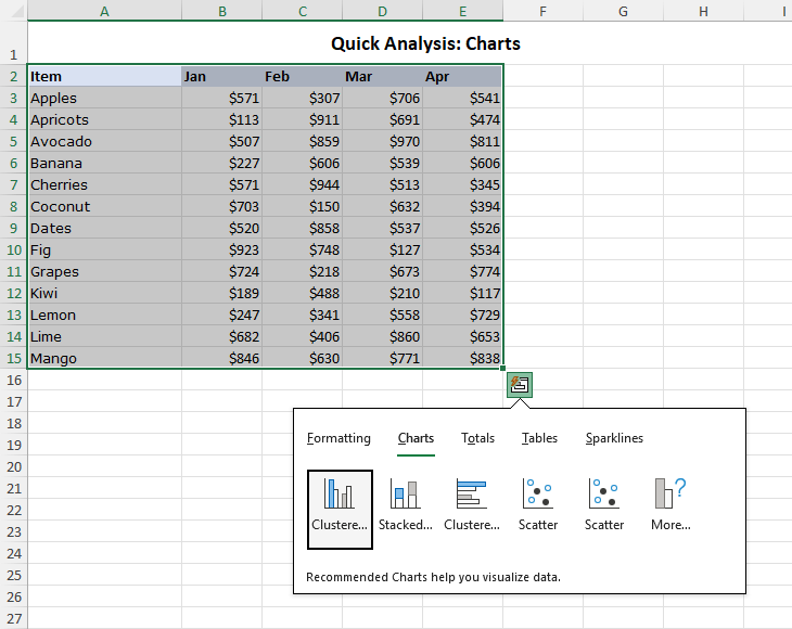
Keyboard shortcut for Quick Analysis Charts: Ctrl + Q then C
Totals
With Totals, you can easily calculate and display various summary statistics for your data, such as sum, average, count, percentage total, and running total.
Depending on the type and format of the data in the selected range, you will see different options for applying totals. For example, if you only have text data, the only option available will be Count, which shows the number of cells with text values.
Totals can be calculated for rows and columns. For vertical summaries in columns, you have several options in the blue color. For horizontal summaries in rows, click the right navigation arrow first, and then you can choose from the options in the yellow color that suit your data best.
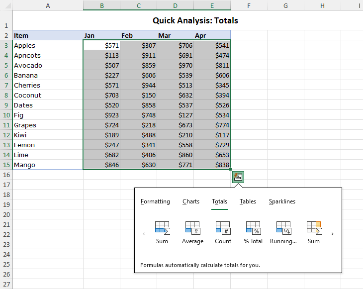
Keyboard shortcut for Quick Analysis Totals: Ctrl + Q then O
Tables / PivotTables
Transform your tabular data into a formatted Excel table, equipped with filtering, sorting, and auto-expanding features for professional data management. Additionally, you can insert a PivotTable in a new sheet using the selected data as the source for more comprehensive data analysis.
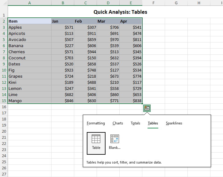
Keyboard shortcut for Quick Analysis Charts options: Ctrl + Q then T
Sparklines
Sparklines are a great way to show data trends in a compact and elegant way. Insert these tiny in-cell charts to visualize patterns within your dataset, choosing from three types: Line, Column, or Win/Loss.
Sparklines can help you highlight important information, such as seasonal variations, outliers, or progress towards a goal. They can also enhance the readability and aesthetics of your reports or dashboards, without taking up too much space.
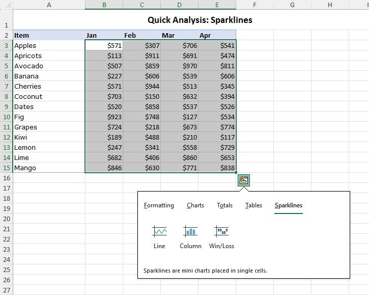
Keyboard shortcut for Quick Analysis Sparklines: Ctrl + Q then S
Examples of using Quick Analysis tools in Excel
Now let’s explorer some practical examples of how you can use the Quick Analysis tools in Excel to analyze your data faster and easier. We will use a sample dataset of monthly sales of different items.
Change a regular range into Excel table
The first thing we do is to turn our sample dataset into an Excel table. Transforming a regular data range into a fully-functional table offers numerous advantages, including automatic expansion for new records, meaning that all the adjustments you make for the current data will be automatically applied to new records without you having to do anything extra.
Here's how you can quickly create a table using the Excel Quick Analysis tool:
- Select your data.
- Click the Quick Analysis button or press the Ctrl + Q shortcut.
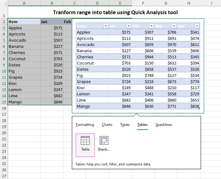
- Within the Quick Analysis menu, navigate to the Tables category and select Table.
This action inserts a table with the default style. You can easily change the table style using Excel's Table Styles gallery or remove table formatting, such as banded rows, shading, and borders, while retaining all other features.
Calculate percentage total for columns and rows
In the same dataset, suppose you want to find out two things: what percentage of total sales is contributed by specific items and within specific months. To achieve this, you can calculate percentage total values for both columns (months) and rows (items). Below are the steps to do this:
- Select the dataset and click the Quick Analysis icon.
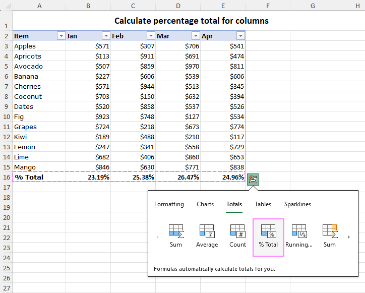
- Under the Totals category, you'll find the % Total option in the blue color. Click on it to calculate the percentage total for columns.
This will insert a new row displaying the sales percentages for each month.
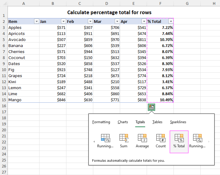
To add percentage total for rows, follow the same steps, but select the % Total option in the yellow color. This will insert a new column displaying the percentage-wise sales for each item.
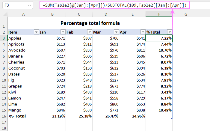
To investigate the formula that the Quick Analysis tool created for you, select any cell with the % Total and look at the formula bar. In our case, the formula contains specific table references:
=SUM(Table2[@[Jan]:[Apr]])/SUBTOTAL(109,Table2[[Jan]:[Apr]])
If you are working with a normal range, this would be a lot simpler formula with standard range references like this one:
=SUM(B3:E3)/SUM($B$3:$E$15)
This formula calculates the percentage of each row's total in relation to the grand total of all rows. The numerator is the sum of the values in the current row, and the denominator is the sum of the values in all the rows. The dollar signs in the denominator make it an absolute reference, so it does not change when copied to other cells.
Highlight cells greater than a specified value
To highlight cells with values above a certain number, follow these steps:
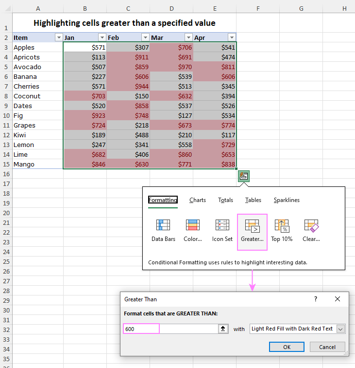
- Select the range of cells you want to format and activate the Quick Analysis button.
- Under the Formatting group, choose Greater Than.
- In the dialog box that appears, type the number you want to compare and select the formatting style (the default is light red fill with dark red text).
- Click OK to confirm your selection.
These steps will promptly highlight all cells with values surpassing the specified threshold.
Create a pie chart
To create a pie chart with the Quick Analysis tool, carry out these steps:
- Select the data range that you want to use for the chart, including the labels and values.
- Click on the Quick Analysis button.
- In the Quick Analysis menu, go to the Charts tab and hover over the Pie chart option. You will see a preview of the pie chart on your worksheet.
- Click on the Pie chart option to insert the graph in your sheet. Alternatively, you can click on More Charts to see other types of graphs that are available for your data.
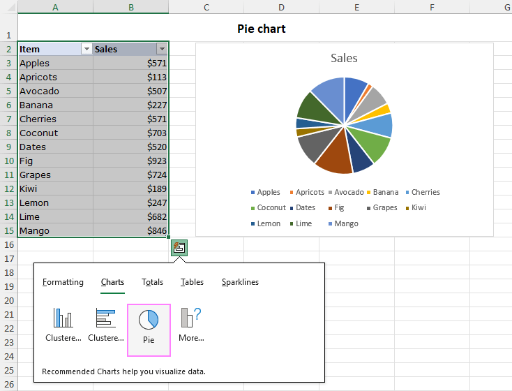
As we’ve created a chart based on a table, it is dynamic by nature – every time you add or remove new records to the table, the chart will automatically update to reflect the changes. This is a very useful feature when you want to visualize data that is constantly changing or growing.
After inserting the chart, you can modify its style, layout, and colors to suit your preferences and needs. You can also add or edit titles, labels, legends and other elements to make your graph more informative and attractive. For detailed instructions, check out Customizing Excel charts.
Insert sparklines
To swiftly create sparklines, i.e. mini-charts within individual cells each representing a row of data from your selection, this is what you need to do:
- Highlight the data range that you wish to visualize with sparklines.
- Click on the Quick Analysis button.
- Under the Sparklines tab, choose the preferred type: Line, Column, or Win/Loss.
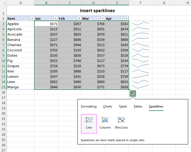
This will create sparklines in the adjacent column, providing a condensed visual representation of your data. You can format and customize your sparklines using the Sparkline tab on the ribbon.
That’s how to use the Quick Analysis tool to simplify common data analysis tasks. So, next time you're working with data in Excel, keep this handy tool in mind. We hope you found this tutorial useful and learned something new today. :)
Practice workbook for download
Using Quick Analysis tool in Excel - examples (.xlsx file)
 by
by