This post describes how to rotate a chart in Excel. You'll learn different ways to spin bar, column, pie and line charts including their 3-D variations. Besides, you'll see how to reverse the plotting order of values, categories, series and legend. Those who often print graphs and charts will read how to adjust the sheet orientation for printing.
Excel makes it really easy to represent your table as a chart or graph. You just select your data and click on the icon of the suitable chart type. However, the default settings may not work for you. If your task is to rotate a chart in Excel to arrange the pie slices, bars, columns or lines in a different way, this article is for you.
Rotate a pie chart in Excel to any angle you like
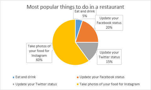
If you often deal with relative sizes and illustrate proportions of the whole, you are likely to use pie charts. In my picture below, data labels overlap the title, which makes it look unpresentable. I am going to copy it to my PowerPoint Presentation about peoples' eating habits and want the chart to look well-ordered. To fix the issue and emphasize the most important fact, you need to know how to rotate pie chart in Excel clockwise.
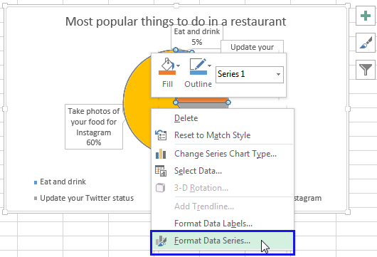
- Right-click on any slice of your pie chart and select the option Format Data Series… from the menu.
- You'll get the Format Data Series pane. Go to the Angle of first slice box, type the number of degrees you need instead of 0 and press Enter. I think 190 degrees will work fine for my pie chart.

After being rotated my pie chart in Excel looks neat and well-arranged.
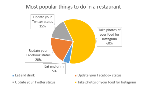
Thus, you can see that it's quite easy to rotate an Excel chart to any angle till it looks the way you need. It's helpful for fine-tuning the layout of the labels or making the most important slices stand out.
Rotate 3-D charts in Excel: spin pie, column, line and bar charts
I think 3-D charts look awesome. When other people see your 3-D chart, they may believe you know it all about Excel visualization techniques. If a graph created with the default settings doesn't look the way you need, you can adjust it by rotating it and changing the perspective.
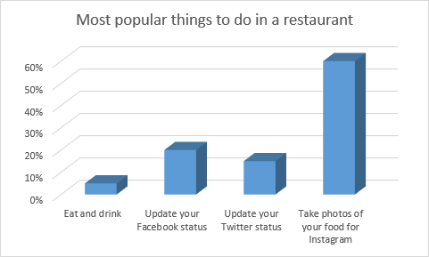
- Right-click on your chart and select 3-D Rotation… from the menu list.
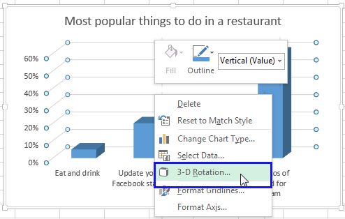
- You'll get the Format Chart Area pane with all available settings. Enter the necessary number of degrees in the X and Y Rotation boxes.
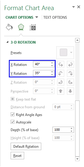
I changed the numbers to 40 and 35 correspondingly to make my chart look slightly deeper.
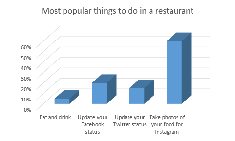
This pane also lets you adjust Depth and Height, as well as Perspective. Just play with the options to see which suite best for your type of chart. Feel free to use the same steps for pie charts as well.
Rotate charts to 180 degrees: change the order of categories, values, or series
If the chart you need to rotate in Excel displays Horizontal and Vertical axes, you can quickly reverse the order of the categories or values plotted along those axes. Additionally, in 3-D charts that have a depth axis, you can flip the plotting order of data series so that large 3-D columns do not block smaller ones. You can also reposition the Legend on your pie or column chart in Excel.
Reverse the plotting order of categories in a chart
You can rotate your chart based on the Horizontal (Category) Axis.
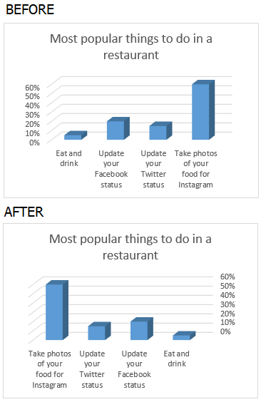
- Right click on the Horizontal axis and select the Format Axis… item from the menu.
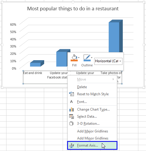
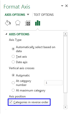
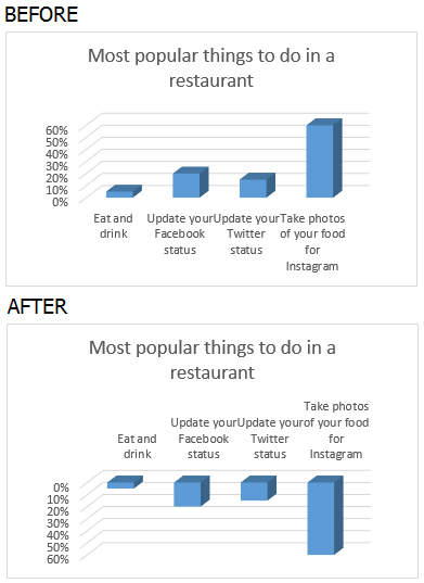
- You'll see the Format Axis pane. Just tick the checkbox next to Categories in reverse order to see you chart rotate to 180 degrees.
Reverse the plotting order of values in a chart
Follow the simple steps bellow to get the values from the Vertical axis rotated.
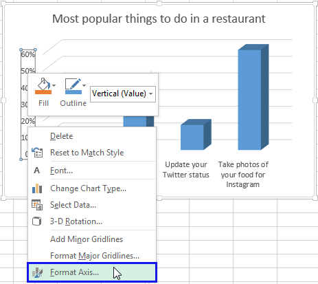
- Right-click on the Vertical (Value) Axis and pick the option Format Axis….
- Select the checkbox Values in reverse order.
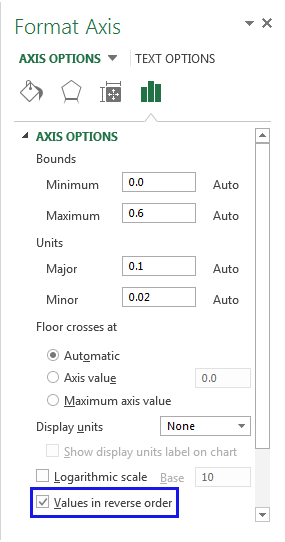
Note. Please remember that it's not possible to reverse the plotting order of values in a radar chart.
Reverse the plotting order of data series in a 3-D chart
If you have a column or line chart with the third axis, which shows some columns (lines) in front of others, you can change the plotting order of data series so that large 3-D data markers do not overlap smaller ones. You can also use the below steps to create two or more charts for showing all values from the legend.
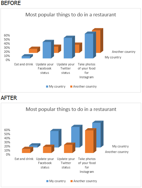
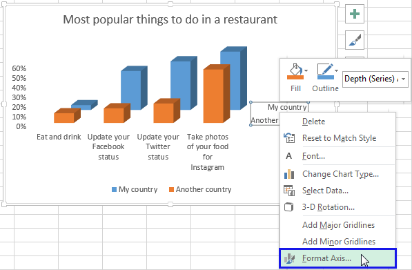
- Right-click on the Depth (Series) Axis on the chart and select the Format Axis… menu item.
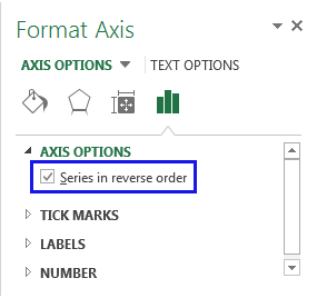
- You will get the Format Axis pane open. Tick the Series in reverse order checkbox to see the columns or lines flip.
Change the Legend position in a chart
In my Excel pie chart below, the legend is located at the bottom. I want to get the legend values on the right to make them more eye-catching.
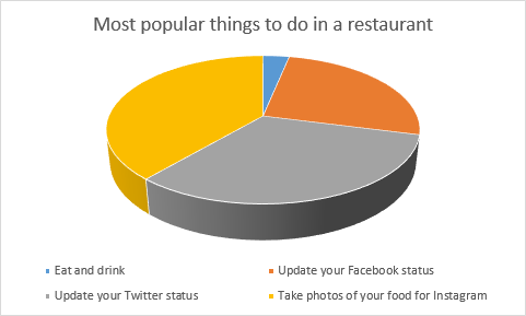
- Right click on the Legend and select the Format Legend… option.
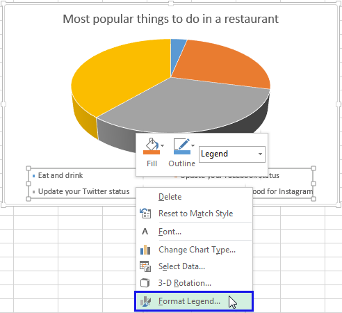
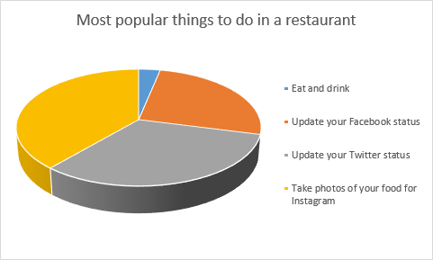
- Select one of the checkboxes you will see on the Legend options pane: Top, Bottom, Left, Right or Top right.

Now I like my chart more.
Modify worksheet orientation to better fit your chart
If you need to just print your chart, it may be enough to modify the worksheet layout without rotating the chart in Excel. On my screenshot below, you can see that the chart doesn't fit correctly. By default, worksheets are printed in a portrait orientation (taller than wide). I'm going to change the layout to a landscape mode for my picture to look correct on the printable.
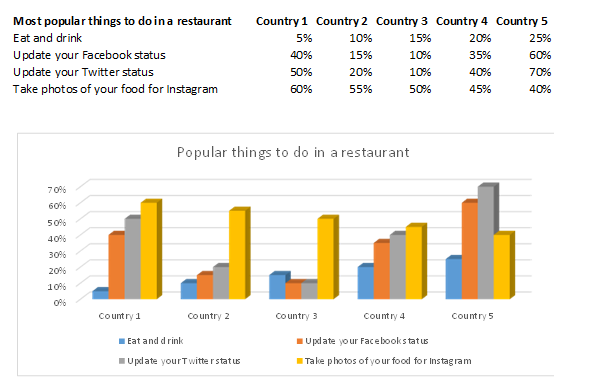
- Select the worksheet with your chart for printing.
- Go to the Page Layout tab and click on the arrow under the Orientation icon. Pick the Landscape option.

Now when I go to the Print Preview window I can see that my chart fits perfectly.
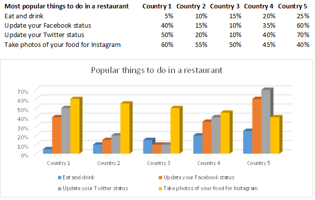
Use the Camera tool to rotate your Excel chart to any angle
You can rotate your chart to any angle using the Camera tool in Excel. It allows you to place the result next to your original chart or insert the picture to a new sheet.
Tip. If you want to rotate your chart by 90 degrees, it may be a good idea to simply modify the chart type. For example, from column to bar.
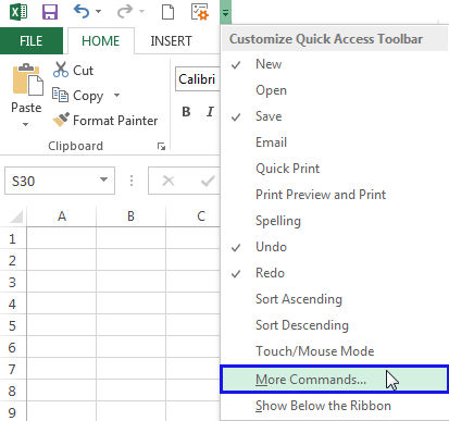
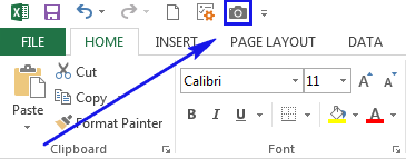
You can add the Camera tool if you go to the Quick Access tool bar and click on the small drop down arrow. Select the option More Commands…
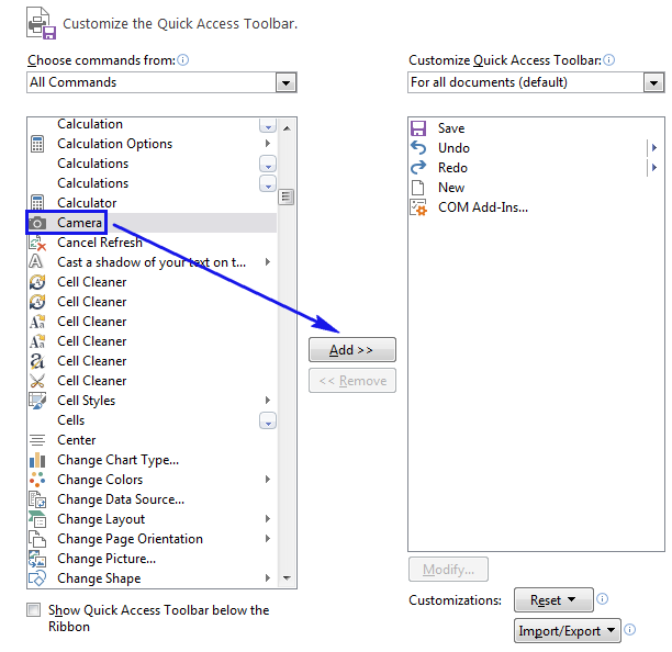
Add Camera by choosing it from the list of all commands and clicking Add.
Now follow the steps below to make the Camera option work for you.
Note. Please remember, it's not possible to place the Camera tool over your chart since the result is unpredictable.
- Create your line or any other chart.
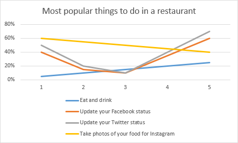
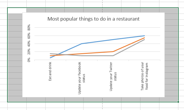
- You may need to flip the alignment of your chart axis to 270 degrees using the Format Axis option I described above. Therefore, the labels will be readable when the chart is rotated.
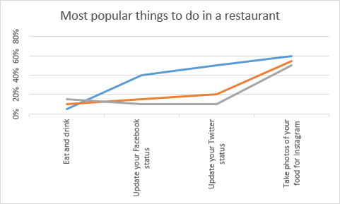
- Select the range of cells that contain your chart.
- Click on the Camera icon on the Quick Access toolbar.
- Click on any cell within your table to create a camera object.
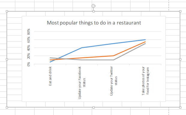
- Now grab the Rotate control at the top.
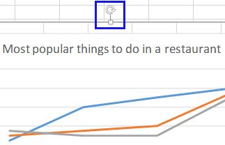
- Rotate your chart in Excel to the needed angle and drop the control.

Note. There is one problem with using the Camera tool. The resulting objects may have a reduced resolution from the actual chart. They may look grainy or pixelated.
Creating a chart is a really good way to showcase your data. Charts in Excel are easy-to-use, comprehensive, visual and can be adjusted to look the way you need. Now you know how to rotate your column, bar, pie or line chart.
Having written all the above I feel like a real chart rotation guru. Hope my article will help you with your task as well. Be happy and excel in Excel!
 by
by
6 comments
The method of the camera makes weird things when you drag the picture (as it were a mirror). It is way easier to use powerpoint, paste there the chart as picture, rotate it and then use it wherever needed. The quality is also slightly higher than with the camera.
Thank you for the input, Dani!
I'm trying to rotate a radar chart that has only four data points. Trying to depict the data points in a quad chart style (four quadrants), so using radar chart which is great but the data is offset to the right by 45 degrees. Is there a way to make the data visible in an X Y axis style (x and y axis ranges are 50 to 50? I can copy the chart and paste into Power Point or Word and rotate that picture, but want to view the rotation directly from the spreadsheet.
Hello Mel,
As far as I understand, you need a four-quadrant chart. Please see the following example that demonstrates an X Y (Scatter) chart.
https://support.ablebits.com/blog_samples/rotate-chart-graph-excel_5_excel_four_quadrant_chart.xlsx
Hello,
with a line chart I'm as far as decribed in step 5 of the rotating chapter. I even got the %-axis as secondary axis on the right hand side, so it'll be on the bottom after the rotation.
But what about a legend? By any chance, how can that thing be rotated as well?
Thanks a lot
Michael
Hello Michael,
The legend rotates together with the chart. Please see the following example.
https://support.ablebits.com/blog_samples/rotate-chart-graph-excel_4.xlsx
Please let me know if you mean something else.