If you use Excel quite often, you know firsthand about the benefits of charts. Graphical representation of your data turns to be very helpful when you want to make a comparison or pinpoint a trend at a glance.
Microsoft Excel has lots of predefined chart types, including column, line, pie, bar, radar, etc. In this article we will go above and beyond creating basic graphs and have a closer look at a special chart type - the Waterfall chart in Excel. You will find out what a waterfall chart is and how helpful it can be. You will know the secret of creating a waterfall chart in Excel and learn about different utilities that can do it for you in a minute.
So let's start brushing up on your Excel skills! :)
What is a Waterfall chart in Excel?
First let's see how a simple waterfall chart should look and when it can come in handy.
A waterfall chart is actually a special type of Excel column chart. It is normally used to demonstrate how the starting position either increases or decreases through a series of changes.
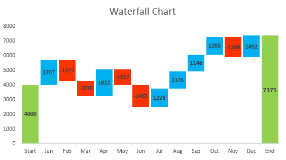
The first and the last columns in a typical waterfall chart represent total values. The intermediate columns appear to float, and show positive or negative change from one period to another, ending up in the final total value. As a rule, these columns are color-coded for distinguishing positive and negative values. A bit further in this article you'll know a trick how to make the intermediate columns float.
A waterfall chart is also known as an Excel bridge chart since the floating columns make a so-called bridge connecting the endpoints.
These charts are quite useful for analytical purposes. If you need to evaluate a company profit or product earnings, make an inventory or sales analysis or just show how the number of your Facebook friends changed during that year, a waterfall chart in Excel is just what you need.
How to build an Excel bridge chart
Don't waste your time on searching a waterfall chart type in Excel, you won't find it there. The problem is that Excel doesn't have a built-in waterfall chart template. However, you can easily create your own version by carefully organizing your data and using a standard Excel Stacked Column chart type.
Let's create a simple sample table with positive and negative values to understand the things better. I'll take the sales amount as an example. If you look at the table below, you'll see that the sales grow during some months, and they fall during others as compared to the starting position.
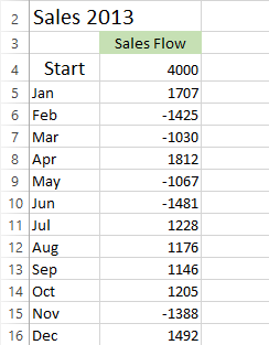
Excel bridge chart will be a perfect way to visualize the sales flow over twelve months. But if you apply a Stacked Column chart template to these particular values now, you'll get nothing similar to a waterfall chart. So the first thing you should do is carefully rearrange your data.
Step 1: Rearrange the data table
You start with inserting three additional columns in your Excel table. Let's call them Base, Fall and Rise. The Base column will be a calculated amount that is used as a starting point for the Fall and Rise series in the chart. All the negative numbers from the Sales Flow column will be placed in the Fall column and all the positive numbers will be in the Rise column.
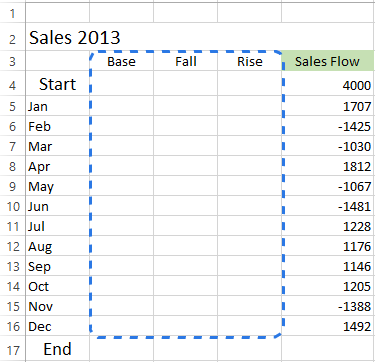
I've also added the End row at the bottom of the Month list to calculate the sales amount for the whole year. Now move to the next step and fill in these columns with the necessary values.
Step 2. Insert formulas
The best way to complete the table is entering special formulas in the first cells in the corresponding columns and then copy them down to the adjacent cells using the fill handle.
- Select cell C4 in the Fall column and enter the following formula there:
=IF(E4<=0, -E4,0)The formula says that if the value in cell E4 is less or equal to zero, the negative number will be shown as positive and the positive number will be displayed as zero.
Note. If you want all the values in a waterfall chart lie above zero, you need to enter the minus sign ( - ) before the second cell reference (E4) in the formula. And two minuses will make a plus.
- Copy the formula down to the end of the table.

- Click on cell D4 and type in
=IF(E4>0, E4,0).It means if the value in cell E4 is greater than zero, all the positive numbers will be displayed as positive and the negative ones as zero.
- Use the fill handle to copy this formula down the column.

- Insert the last formula
=B4+D4-C5in cell B5 and copy it down; include the End row.
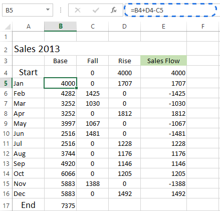
This formula calculates base values that will prop up the rises and falls to the appropriate height.
Step 3. Create a standard Stacked Column chart
Now your data are well-organized and you are ready to build the chart itself.
- Select your data including the column and row headers, exclude the Sales Flow column.
- Go to the Charts group on the INSERT tab.
- Click on the Insert Column Chart icon and choose Stacked Column from the drop-down list.

The graph appears in the worksheet, but it hardly looks like a waterfall chart. Take the next step and turn the stacked column graph into Excel bridge chart.
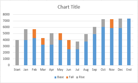
Step 4. Transform the column graph into a waterfall chart
The time has come to know the secret. You just need to make the Base series invisible to get a waterfall chart from a stacked column.
- Click on the Base series to select them, right-click and choose the Format Data Series… option from the context menu.
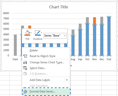
The Format Data Series pane immediately appears to the right of your worksheet in Excel 2013 / 2016.
- Click on the Fill & Line icon.
- Select No fill in the Fill section and No line in the Border section.

When the blue columns become invisible, just delete Base from the chart legend to completely hide all the traces of the Base series.
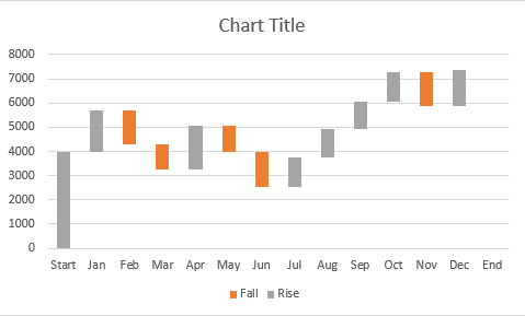
Step 5. Format Excel bridge chart
Let's finish up with a little formatting. First I will make the flying bricks brighter and highlight the Start and End values in the chart:
- Select the Fall series in the chart and go to the FORMAT tab under CHART TOOLS.
- Click on Shape Fill in the Shape Styles group.

- Pick the color you want in the drop-down menu.
Here you can also experiment with the column outline or add special effects to them. Just use the Shape Outline and Shape Effects options on the FORMAT tab to make changes.
Then you should do the same trick with the Rise series. As for the Start and End columns, you need to color-code them individually, but they should be of the same color.
When you are done, the chart should look like the one below:

Note. Alternatively, you can change the color and outline of the columns in the chart by opening the Format Data Series pane or choosing the Fill or Outline options in the right-click menu.
Then you can remove excess white spaces between the columns to make them stand closer to one another:
- Double-click on one of the chart columns to bring up the Format Data Series pane.
- Change the Gap Width to something smaller, like 15%. Close the pane.

Now the holes in the bridge chart are patched.
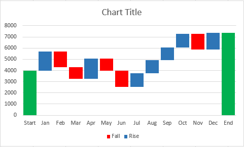
When you look at the waterfall chart above, some of the flying bricks seem to be of the same size. However, when you refer to the data table, you'll see that the represented values are different. For more accurate analysis I'd recommend to add data labels to the columns.
- Select the series that you want to label.
- Right-click and choose the Add Data Labels option from the context menu.

Repeat the process for the other series. You can also adjust the label position, the text font and color to make the numbers more readable.
Note. If there is an apparent difference in column size and the specifics aren't important, you can omit the data labels, but then you should add a Y-axis for better data interpretation.
When you are done with labeling the columns, just get rid of unnecessary elements such as zero values and the legend. You can also change the default chart title to something more descriptive. Please take a look at one of my previous blog posts how to add titles to Excel charts.
My waterfall chart is ready! It looks completely different from the commonly used types of charts and it is very readable, isn't it?

Tip. If you need to create waterfall charts on a regular basis, you can save your favorite one as a custom Excel template.
Add-ins for creating waterfall charts
As you can see, it is not difficult at all to manually create a waterfall chart in Excel 2016 - 2010. But if you don't want to mess with rearranging your data, you can use special add-ins that can do all the work for you.
Jon Peltier offers to use his time-saving Peltier Tech Chart Utility to automatically create waterfall charts and other custom graphs from raw data. You can choose to make either a standard Waterfall Chart or a Stacked Waterfall Chart. It is not necessary to enter any formulas, just select your data, click the Waterfall Chart command in the Ribbon, set a few options, click OK and Excel bridge graph is ready. In addition to custom charts, the add-in provides you with different Chart, Data and General Tools to make your work in Excel easier.

You can even create a waterfall chart online and receive it as an Excel file by email. It is possible thanks to a great waterfall-chart online service. You just need to submit your data, specify your email address and wait less than a minute while your chart is generated. Then check your inbox. The waterfall chart is sent to you in an Excel file. You can then change the title, labels, colors, etc. like in any other Excel chart. However, you cannot change the numeric data. In this case you will have to create a chart again. You should also follow some rules of submitting your data if you want your waterfall chart to look as expected.
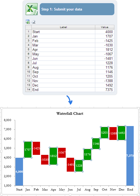
The more complex chart you want to build, the more complex formulas you have to enter when rearranging your data. And the chance of getting an error is increasing. In this situation the Waterfall Chart Creator add-in for Microsoft Excel can help you save your time and effort. With this add-in you can create, change and update multiple waterfall charts at a time. It allows you to specify colors, solid or gradient fill, show values and position, and gives you many other options. You can also customize the default settings and colors for new charts.
Now you've got a collection of waterfall charts in Excel. I hope it won't be a problem for you to manually create your own version of a bridge graph. Otherwise, you can take advantage of Excel waterfall chart add-ins.
Thank you for reading. If you are curious of other means of data visualization, the following articles may also be interesting for you:
 by
by
161 comments
For column BASE, if I use the formula mentioned in Step 05 for all cells below, I don't get the same values that you are showing in your example. How do you have same values for different months with different inputs (see March and April, column BASE)?
Hi! In the BASE column in Step 5 I get exactly the values shown in the screenshot. Check your calculations or explain the problem in more detail.
Great
Very useful article
Hi Ekaterina,
thank you. It was simple compared to others.
This is an excellent article on how to make Excel bridge charts that also allows you to display data on the chart aside from the values. I use it in place of the native Excel 2016 waterfall chart because I can display both the values and the % on the chart. Love it! However, I am struggling to figure out how to make it work when the initial flow value is positive and final flow value is negative. Any suggestions on how to do that?
thanks for the great article and detailed explanation. My first waterfall looks great!!
Thanks a ton for such a detailed and clear explanation! It worked perfectly :)
Very Good Article. helped me
Can we create a waterfall with HTR data?
I have the Head to Tail ration for each fiscal and I want to show the ramp up or ramp down in a waterfall as each fiscal progresses as a now Vs Future visual board.
Dubuk is correct, but the built-in waterfall chart is not supported in Excel on-line. So if you want to show it on-line, it's back to basics
Excel has a built-in waterfall chart. Go to Insert and it is the third chart type on the left of Recommended charts.
This is very good blog and great explanation.
Nice explanation
Thanks for the trick! This is excactly what I'm looking for.
Thanks for the explanation, it worked for me.
This was a perfect demonstration for getting me started, using Excel, without having the luxury of other available software
the negative number go down below line. How can i move up to upper line?. how did you change it to positive number to get the waterfall chart.
Hey!! Bespalaya
Thanks a lot.
Great stuff. Thanks
Excellent exolanation.